competitive analysis
user research
synthesis
feature prioritization
rapid sketching
low/midFi prototyping
user flow diagramming
user testing & evaluation
visual ideation
hiFi prototyping
wireframe annotation
stakeholder presentation
Competitive Analysis
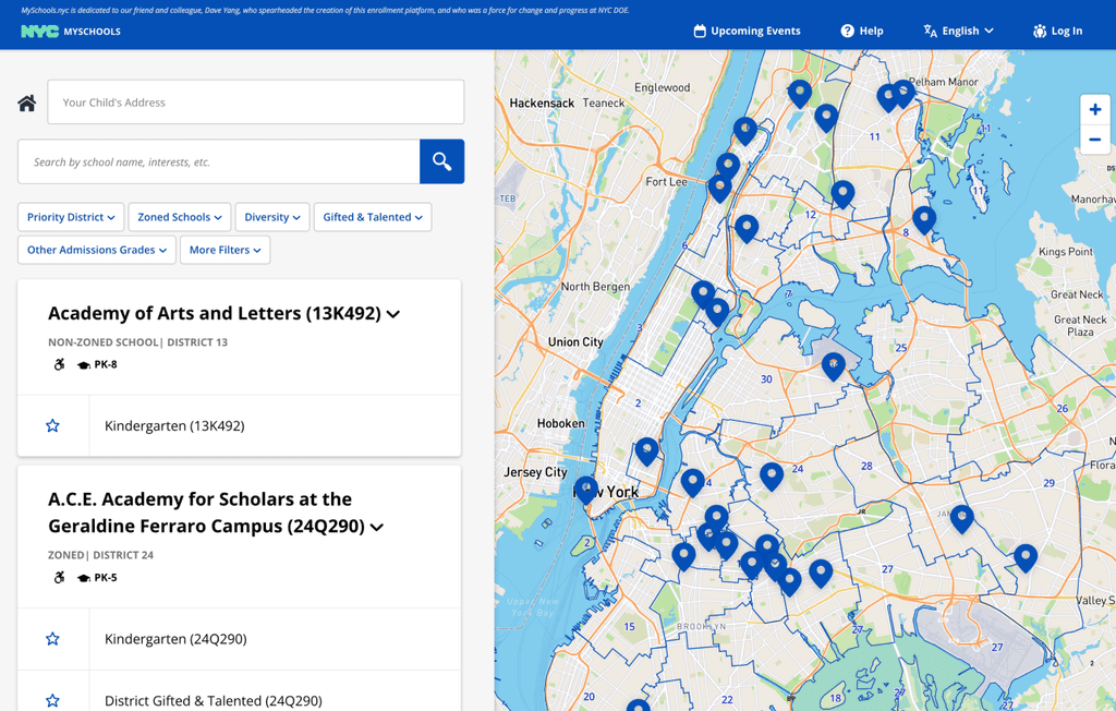
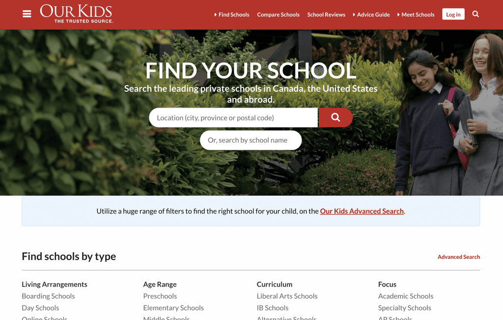
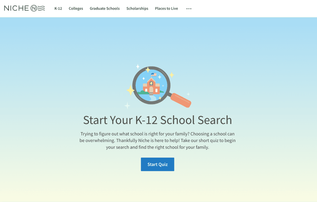
I looked to competitors to compare features and establish industry standard for user expectations. All of the competitors:
Filters are necessary to customize results to suit family's constraints around location, budget, and teaching methods
Parents were lacking a comprehensive database including both private and public school information
Matching quizzes help parents begin their search from scratch
User Research
In order to further understand our audience, I conducted five 1:1, 60 minute interviews via Zoom.
Parents searching for schools
NYC residents
Parents of kids
between 3-17
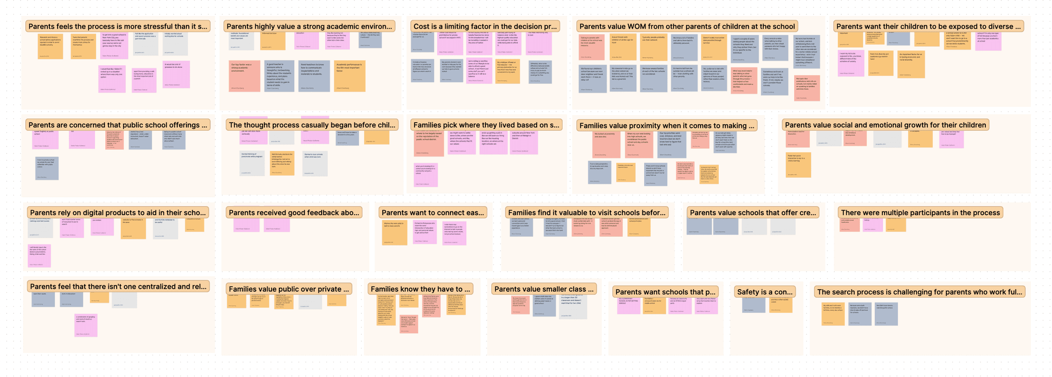
Post interviews, I created an affinity diagram together to synthesize the insights pulled from each interview.
Key Participant Pain Points:
“It’s frustrating that there isn't one centralized and reliable database of information about schools”
“Talking to parents with children at the school was the most valuable resource”
“I wish there was somewhere to go to talk to parents with my same values instead of just reading reviews”
The Ideation Process To MidFi
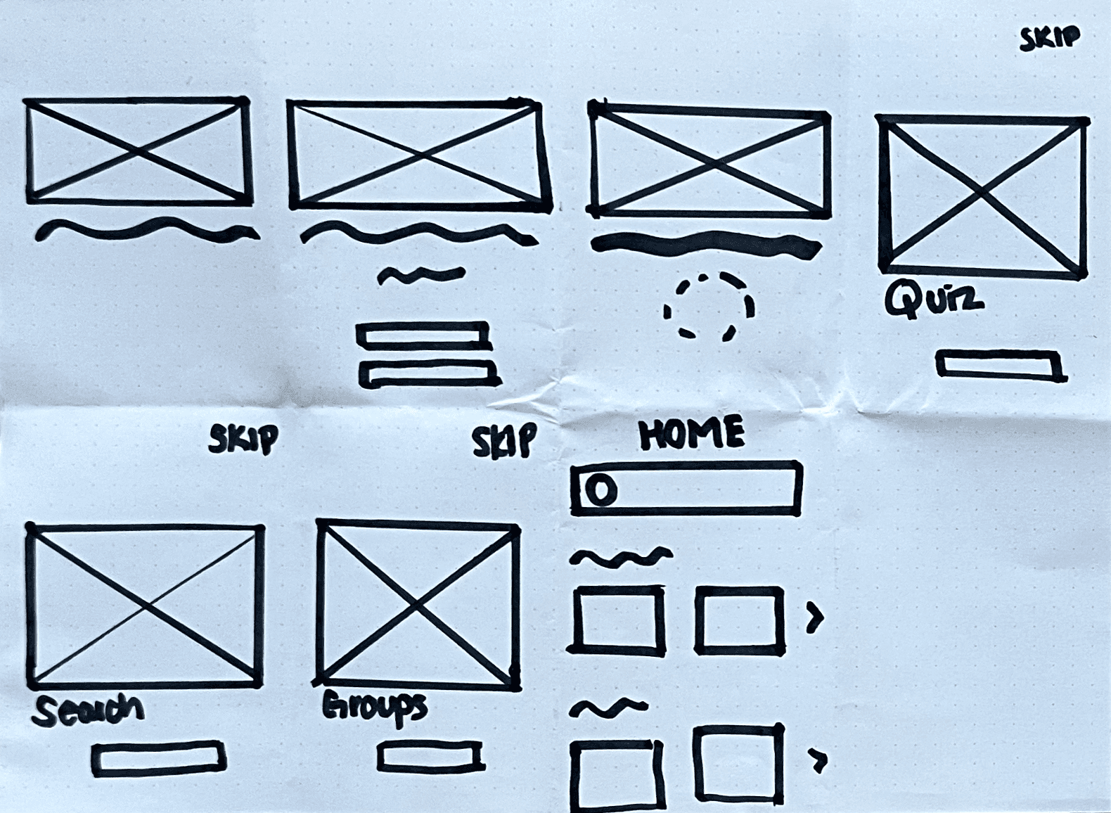
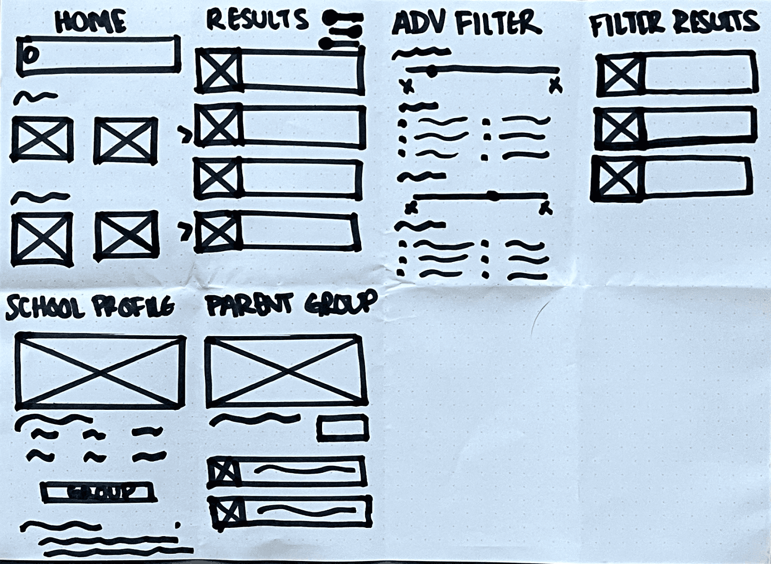
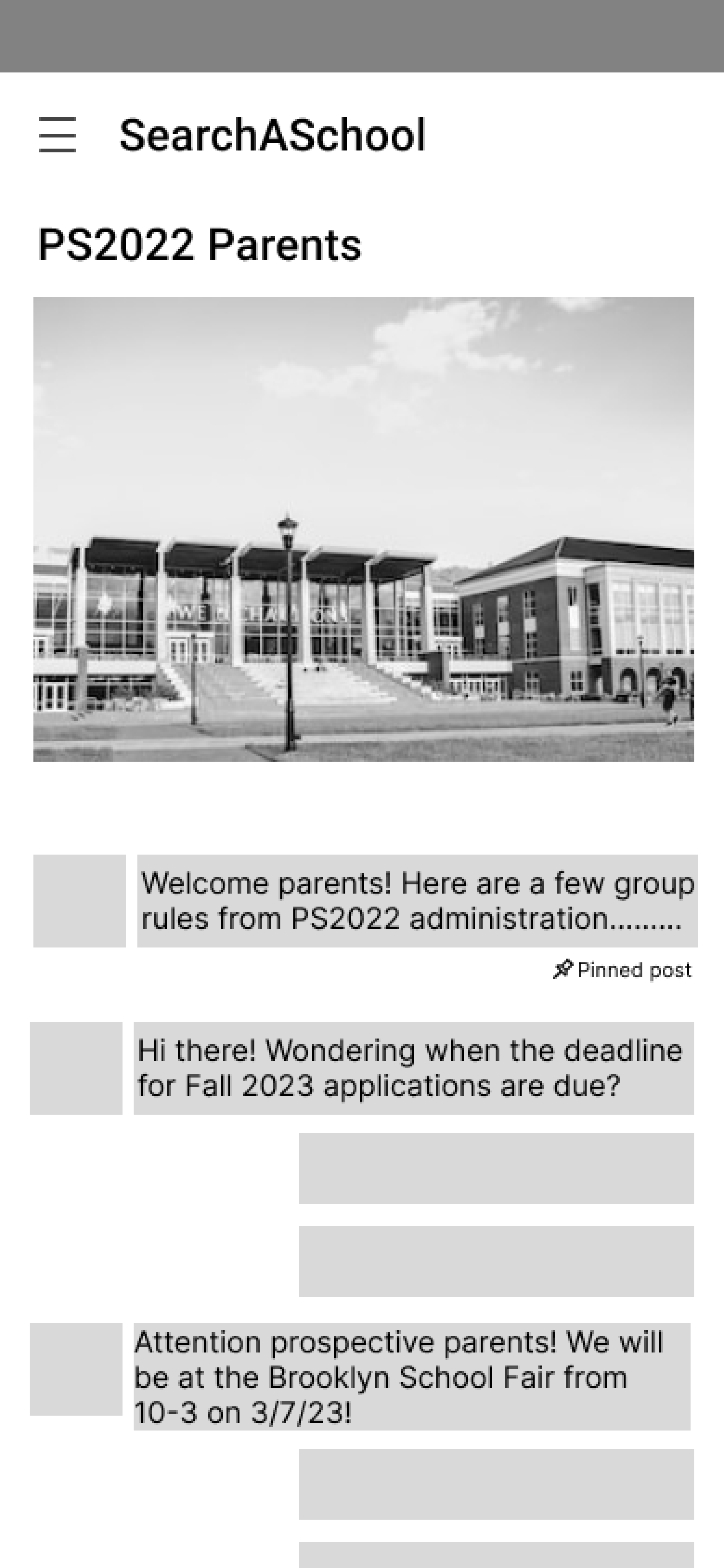
I rapid sketched a potential task flow that guides users to a space to talk with other parents.
User Opens App->User Signs Up->App Loads->User Skips Onboarding Screens (School Matching Quiz/Adv Search/Search For Parent Groups)->User Arrives At Dashboard
I streamlined the user journey from app launch to parent group with a user flow diagram.

Job: A new user needs to ask fellow parents about a school that they are considering for their child
I brought the user flow diagram into a mid fidelity prototype to validate the pathway in usability testing.


Validating MidFi Concepts With Usability Testing
The Participants
Parents of kids 3-17
NYC residents
Parents who have completed school search
I met with potential users in person, one on one and asked them to think through their process out loud as they completed the following task scenario:
"One parent group per school could get spammy and result in a ton of unwanted notifications"
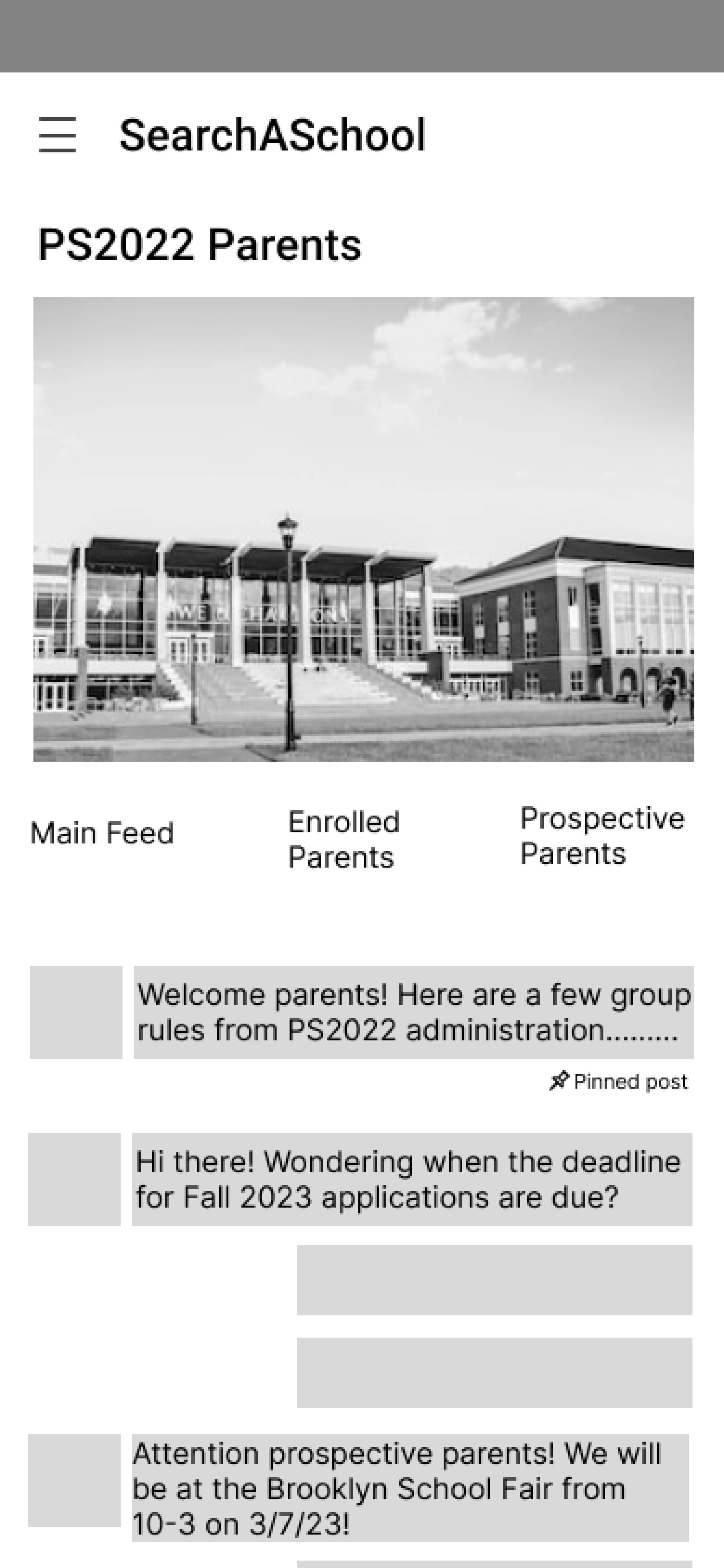
"Separate sections for enrolled parents and prospective parents would help me find the right contact faster."
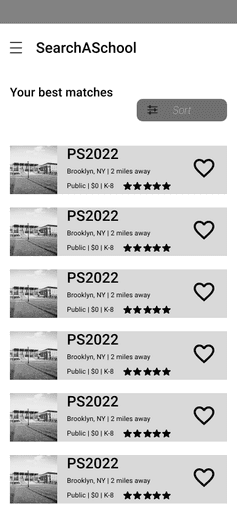
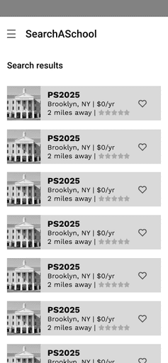
"It's redundant and busy for info I filtered for show up again on the results page. I know the age range of the school because I just filtered for it."
How I iterated based on user feedback:
Visual Ideation
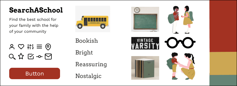
During interviews, participants repeatedly communicated feelings of overwhelm, stress, and distrust which greatly informed the visual direction of the product.
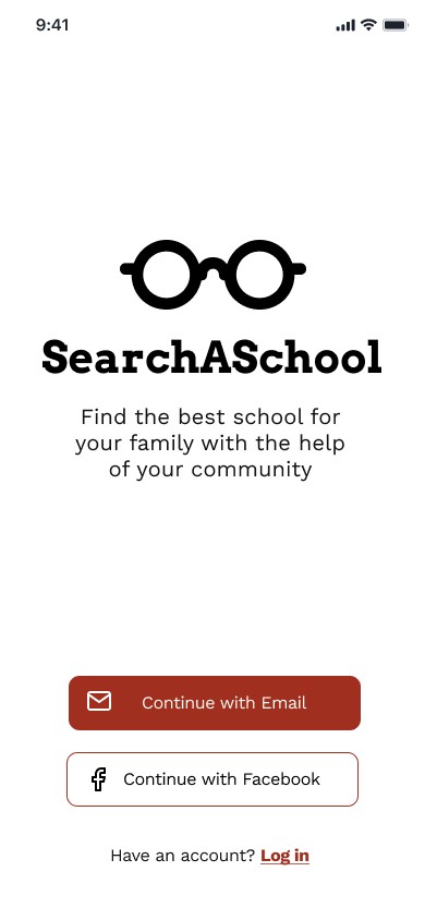
I leaned into childhood nostalgia and academia for the header font and logo to inspire trust and a simple body font for legibility.
I opted for school bus yellow for its mood boosting brightness, green to echo vintage chalkboards and reliability, and red to establish authority.
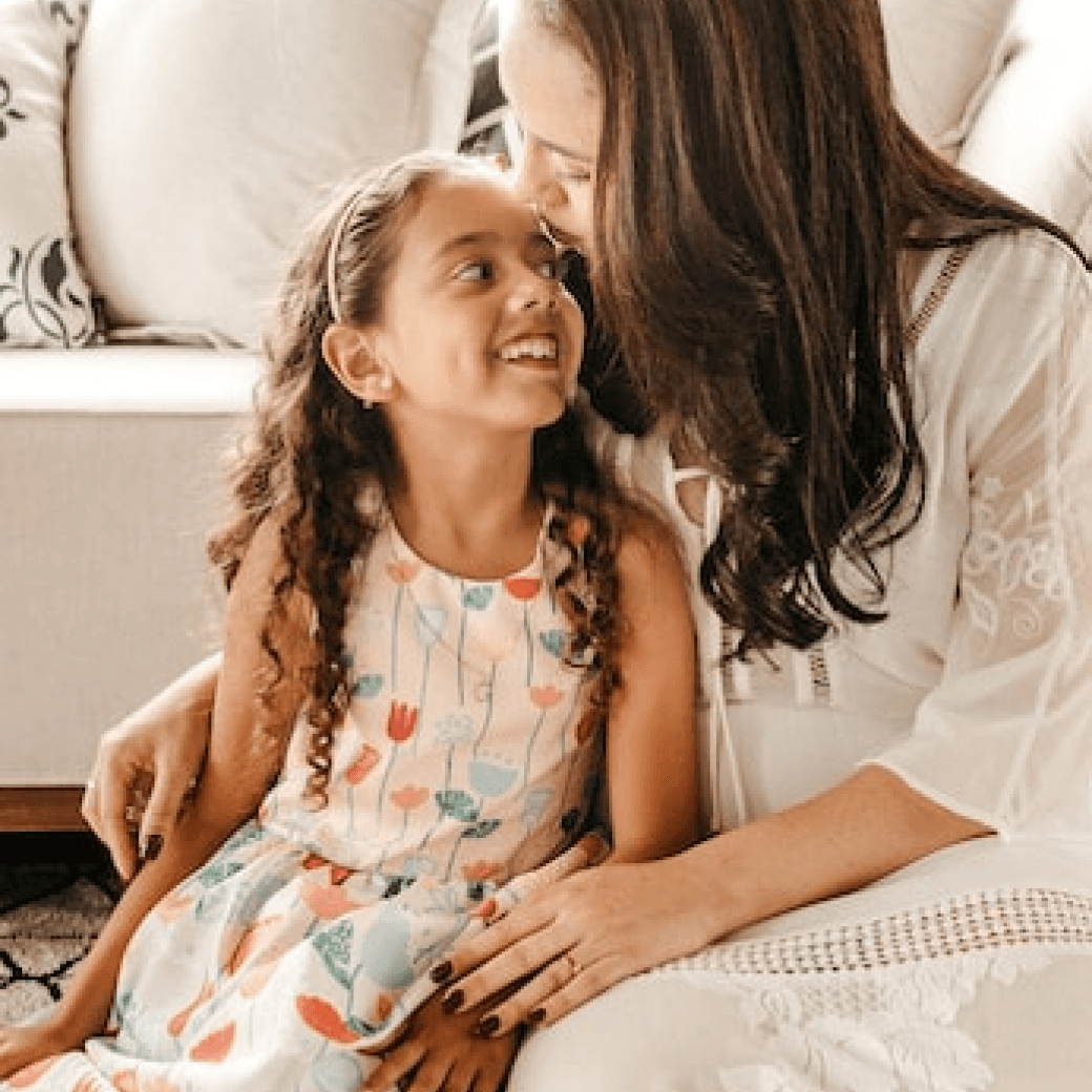
I used abstract illustrations in the launch sequence so all families could relate and photos of schools to give an accurate preview.
HiFi Prototype Version 1
My first HiFi prototype takes the user all the way through their main objective, to meet and connect with other parents that can help support them in their school search decision making.
HiFi Prototype Iteration
Upon finishing my Flatiron program, I conducted an additional round of usability testing with 3 senior product designers and 1 frontend developer to validate the visual design choices I made.
I used the same task scenario as my first round of testing and asked them to think out loud not just about the task flow but the visual design choices as they navigated my hi fidelity prototype.
Key Insights:
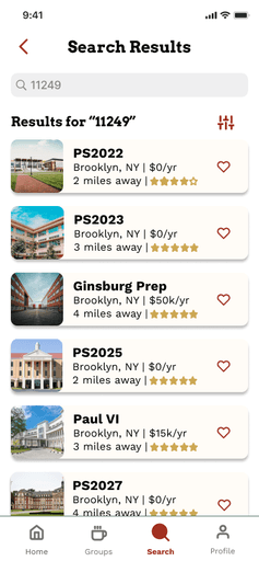
"The use of cards is cluttered, hard to read, and distracting from the photo content"
"The red CTAs give the impression of an error message"
"It's hard to read group comments and figure out how to post comments"

I revised my color application (10% red, 30% yellow, 60% green) so that green was now the CTA color to imply action and movement to help users flow through the product and updated the logo and illustrations to align with new color application.

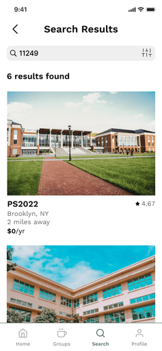
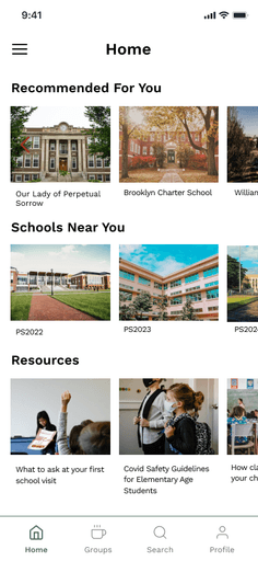
I removed the cards from the school result page and the group pages and utilized subtle dividers instead.
I decluttered the text under each school on the results page even further and enlarged the image so the user could let their eyes rest on the image of the school and click into the school profile if they needed more information.
I made the header font Work Sans in a heavier weight to provide appropriate hierarchy and limited my use of Arvo to the logo font only to make headings more legible and make the entire product feel more modern and current.
I removed the cards from the school result page and the group pages and utilized subtle dividers instead.
