Case Study: Hugo
Domain Research
Competitive Analysis
Moodboarding
Final Site Map
Style Tiles
MidFi Marketing Landing Pages
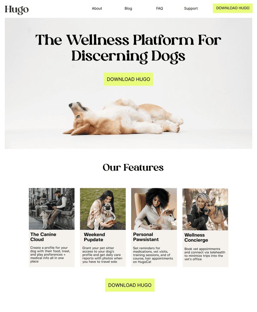
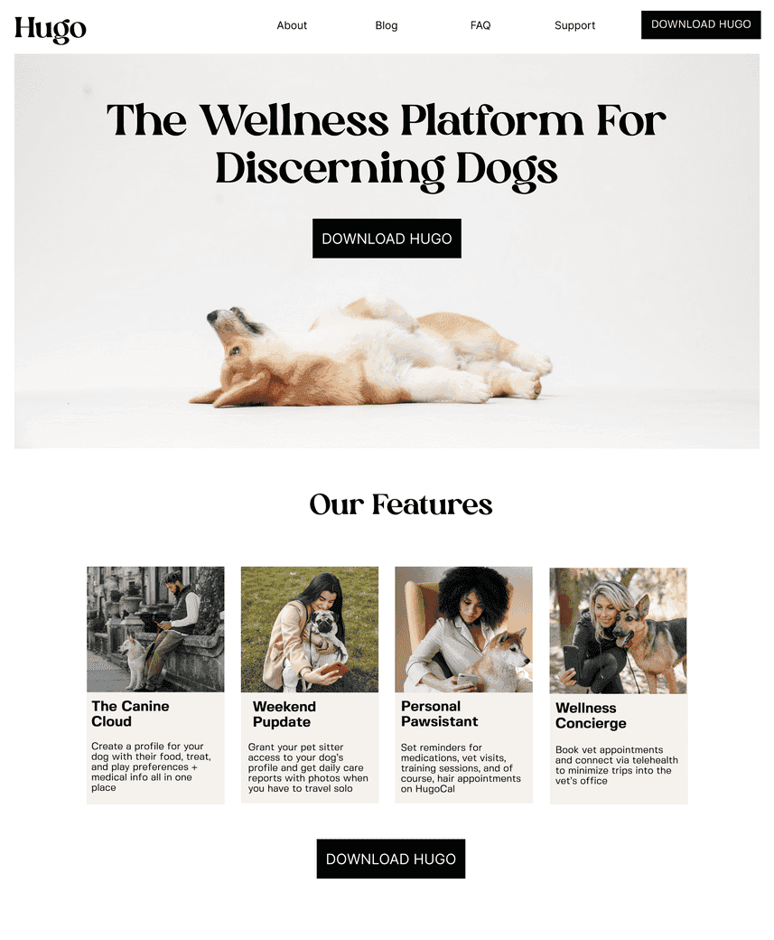
HiFI Marketing Landing Pages
App Sneak Peek
Stakeholder Presentation
Understanding The Industry & The Users
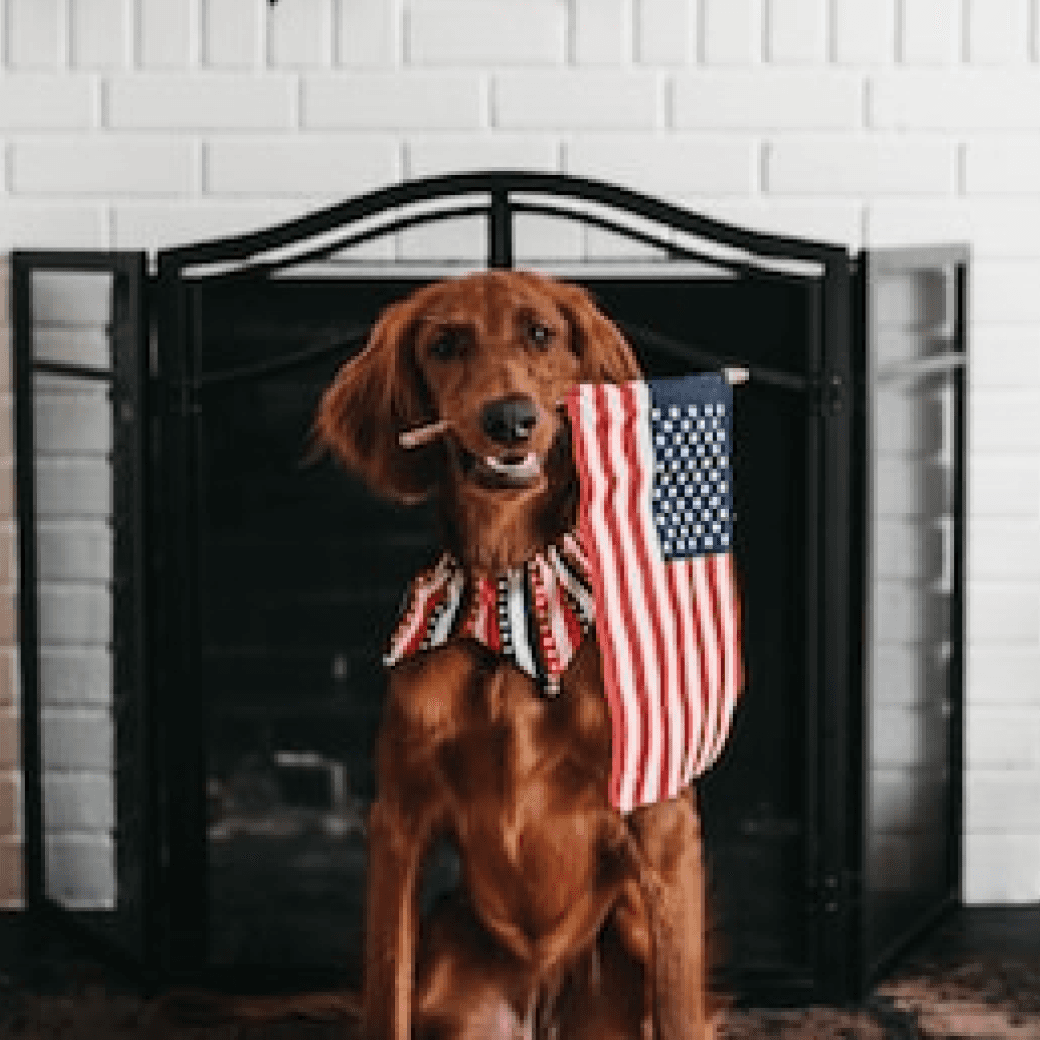
40% of households in the United States own at least one dog.
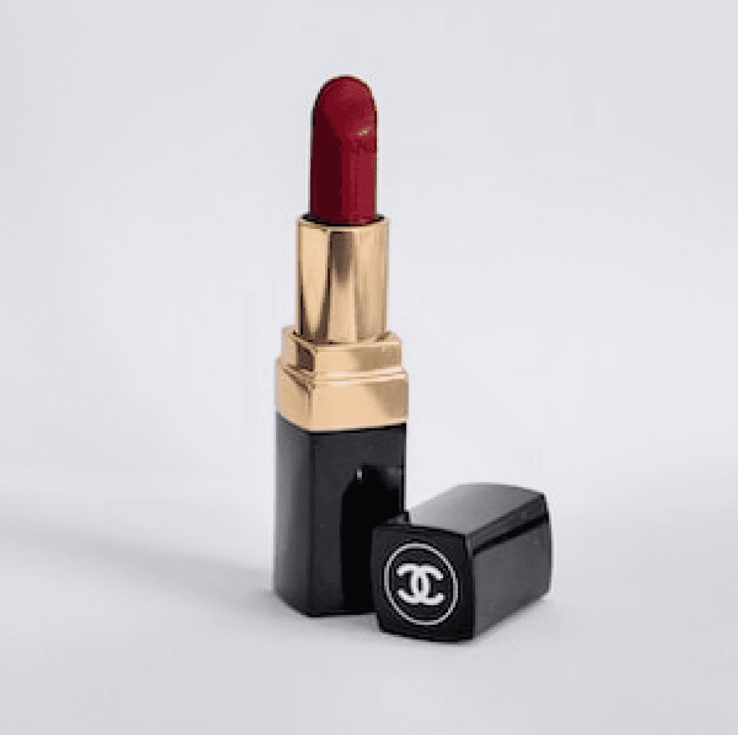
Consumers spend more on little luxuries like designer lipstick during recessions.

More millennials are waiting to have children but live in dual income households with expendable income.
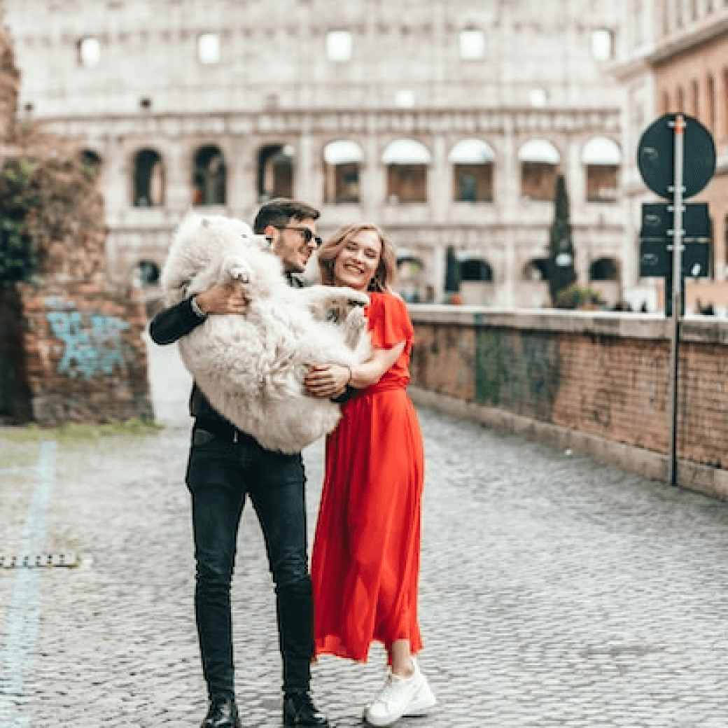
Millennial pet owners say that they think of pets like human children and pampering them is a source of happiness.
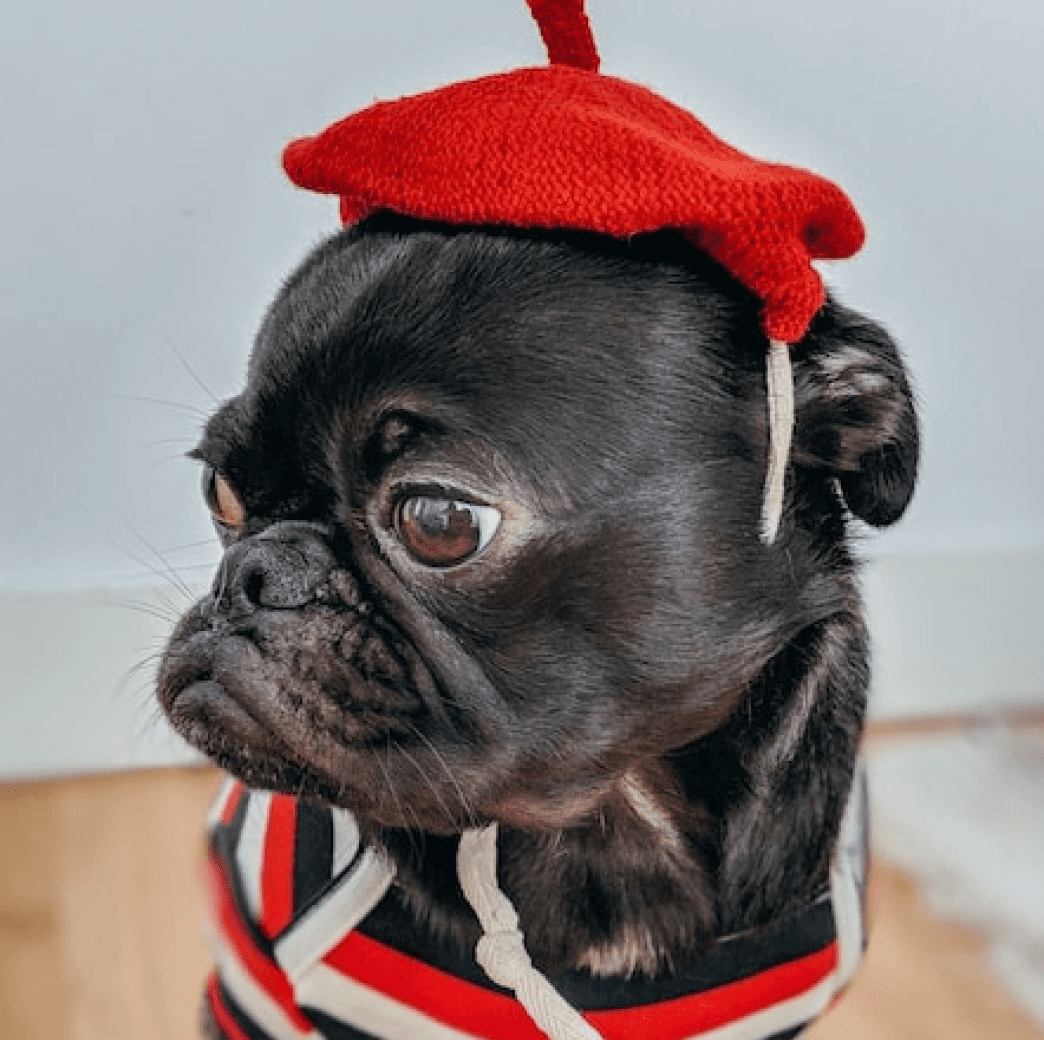
Paris is the global capital of dog parent culture with the most dogs per km2 of any city.
Competitive Analysis
I looked at the the brand and styling choices of our competitors to get a feel for design trends they were using and to identify any potential opportunities to differentiate the Hugo branding and make it stand out in a busy industry.



Key Takeaways:
Use of cool blues, greens, and purples to make stressful parts of pet parenting calming and groudned
Too many cool tones can feel cold and disconnected juxtaposed with playful, friendly copy
None of the competitors positioned themselves in the luxury space- creating an opportunity for Hugo
Iterating On The Style Guide
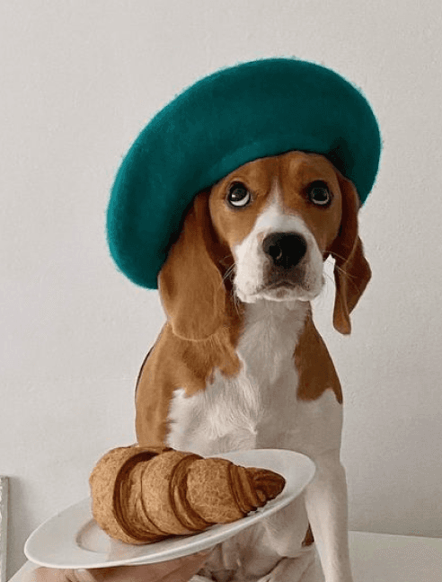
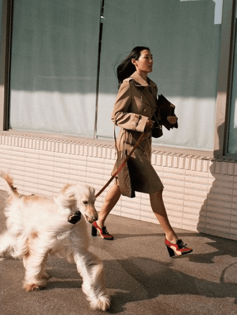
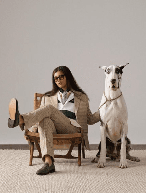
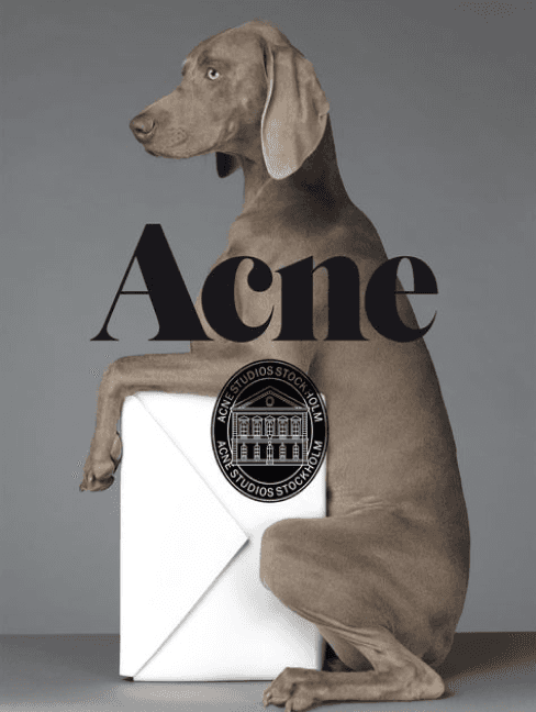
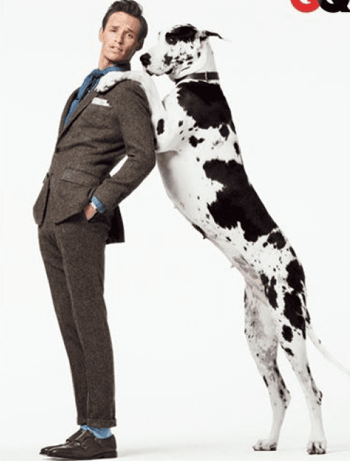
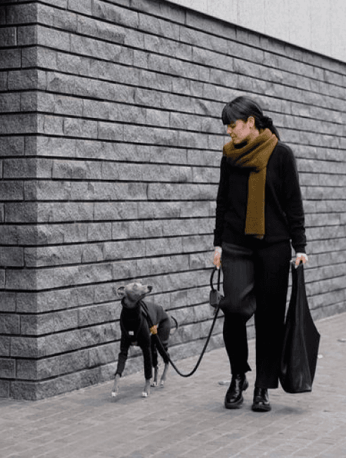
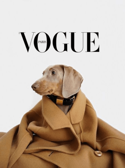
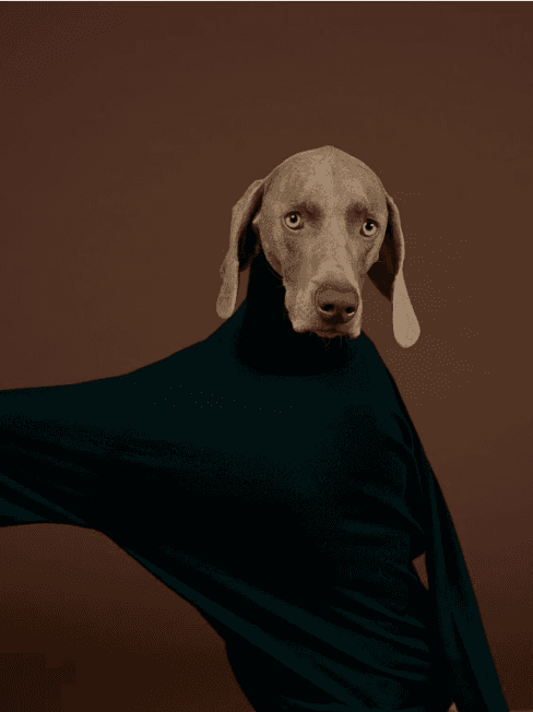
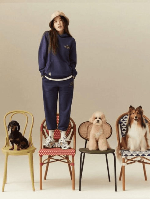
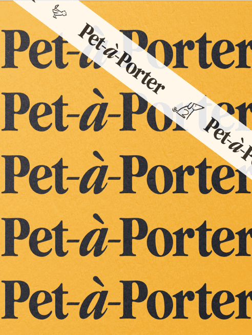
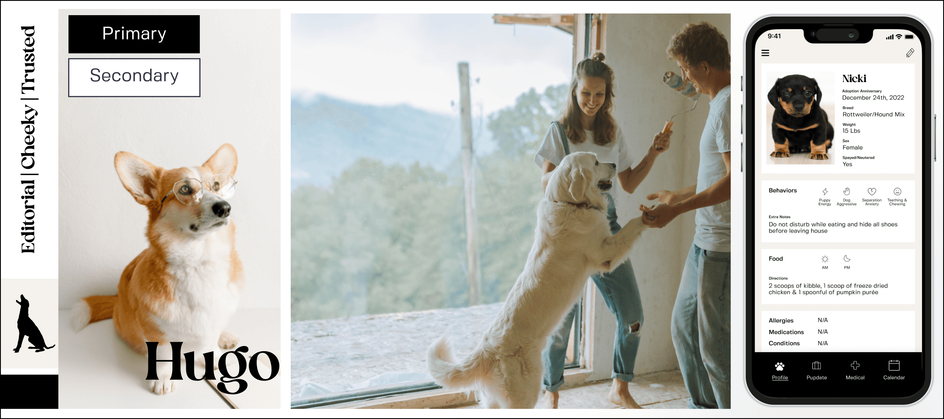
Moodboarding: Knowing that I wanted to position Hugo as a luxury product and that Paris is a hub for dog parents, I looked to high fashion and French culture to serve as the visual inspiration for the brand along with images that depict the humanizing of pets as children the way our users do. I curated a moodboard that reflected the energy of the following adjectives:
Editorial
Cheeky
Trusted
Color: I experimented with 4 divergent palettes in an attempt to convey trustworthiness and respect.
Ultimately, I chose palette 4 to emulate print media for esteem and to draw the eye to imagery.
Typography: I chose Silk Flower as a classic but playful serif font to balance out the minimal color palette for the logo and headers and Fivo Sans for clear body copy.
Name: Because modern pet parents treat their dogs like human children, it was integral to Hugo’s brand identity to have a human name.
Hugo is brief, catchy and easy to pronounce to increase the likelihood of reaching notoriety in the market
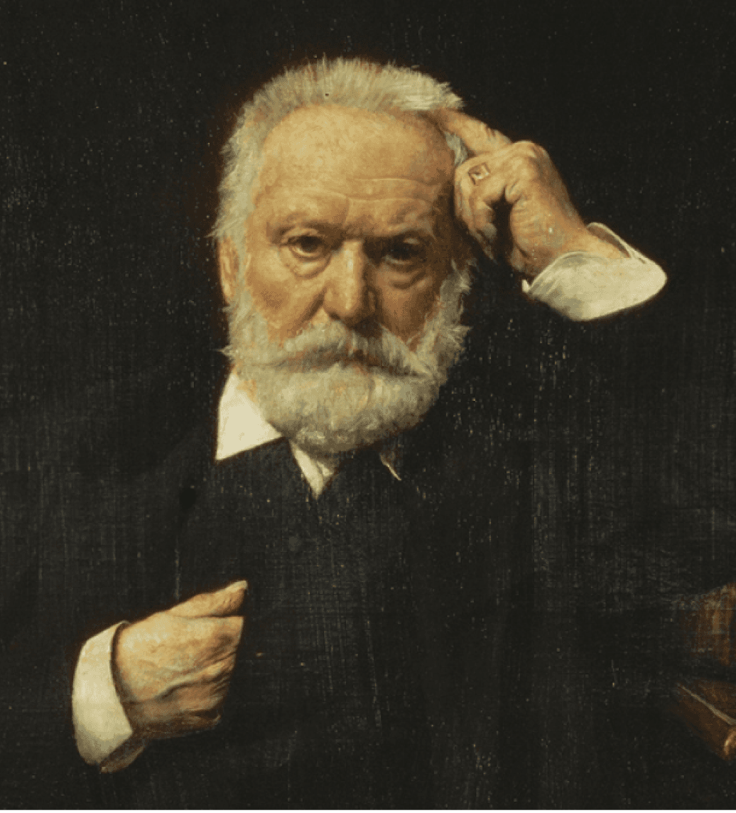
An homage to esteemed French literary figure, Victor Hugo, communicates that users can trust us with their pet’s well being and position us in the luxury market.

Nodding to Hugh Grant, whose public persona of clumsy, posh goofiness epitomizes the personality of our mascot as playful and aspirational.
Logo: The dog silhouette logo was inspired by Victorian era portraiture allows all parents to see their dog in Hugo and conveys both sophistication and accessibility as silhouette portraits were the most affordable way to commemorate loved ones at that point in history.
After usability testing, users reported that silhouette options 1 and 3 were harder to decipher as dog’s, so based on user feedback I chose silhouette option 2 as the final logo.
Read more in the official Hugo style guide.
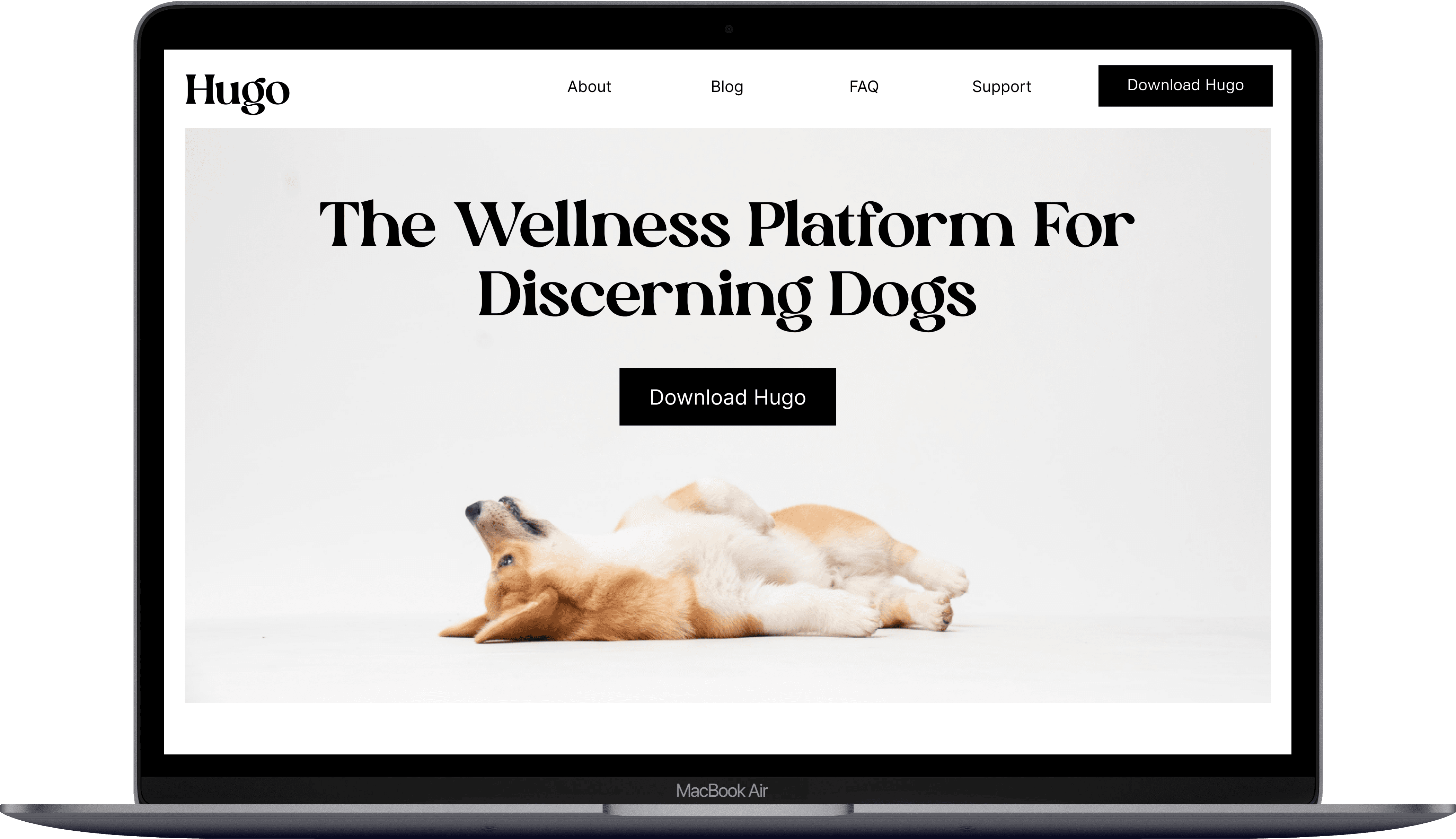
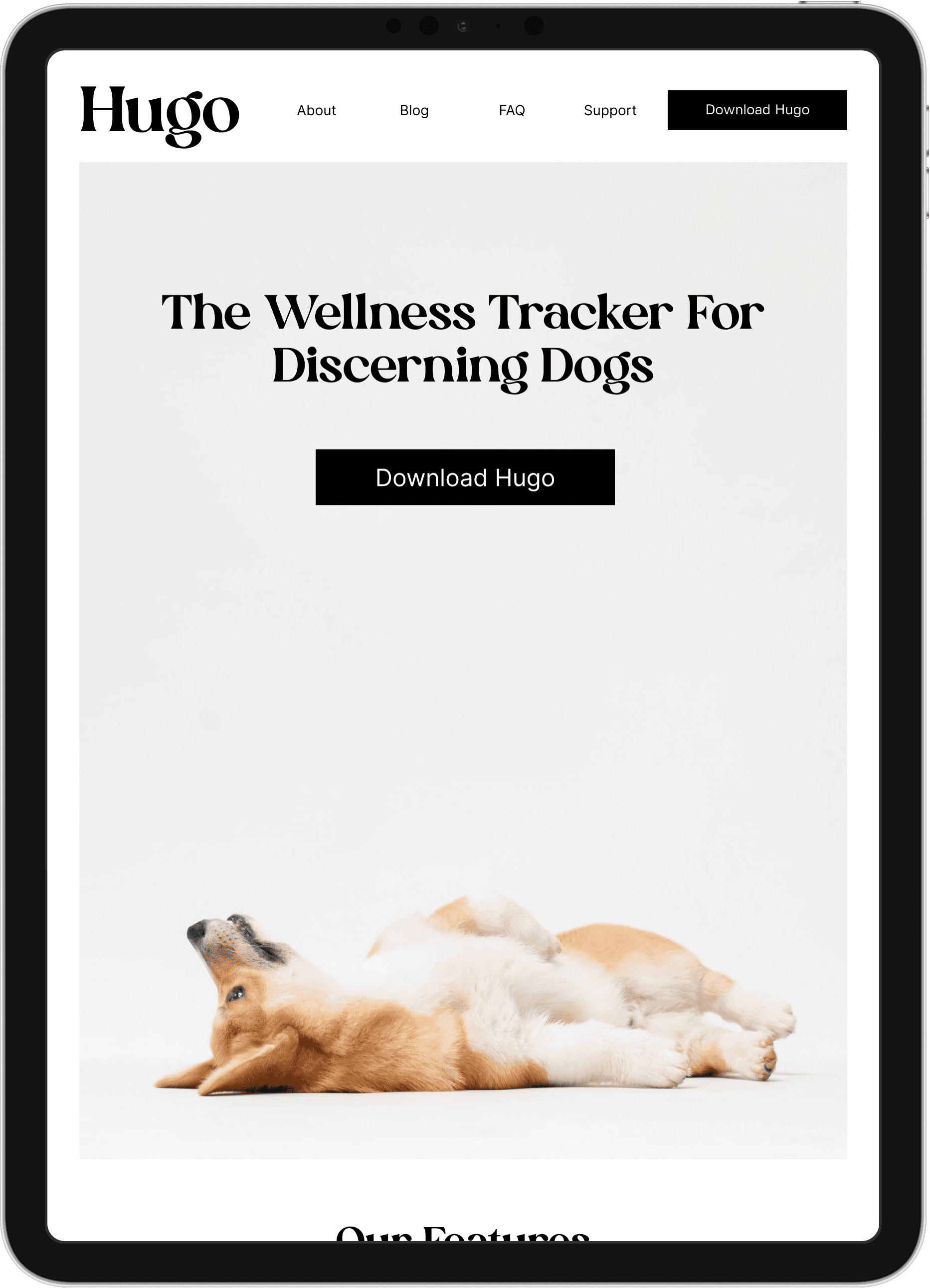
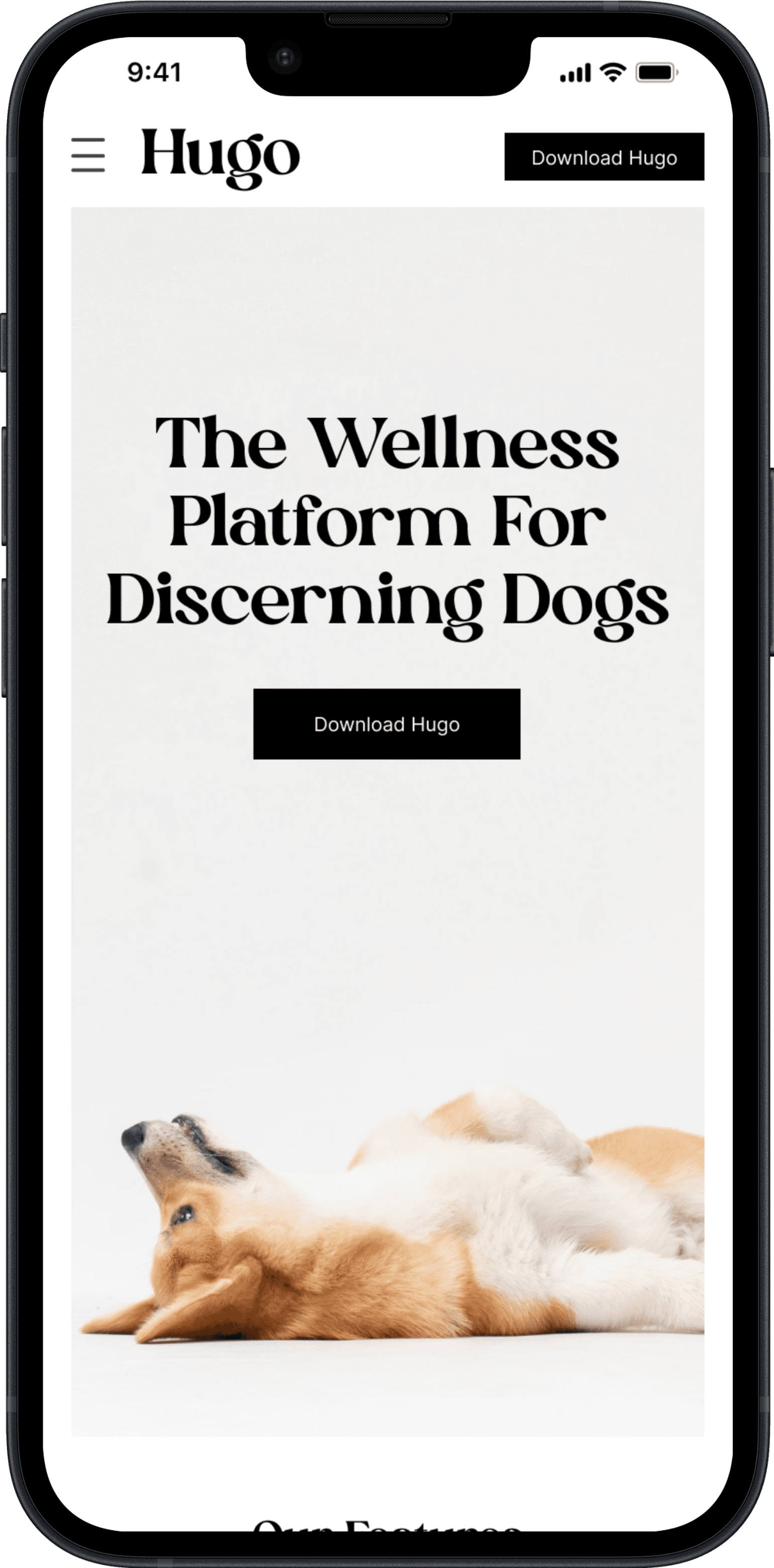
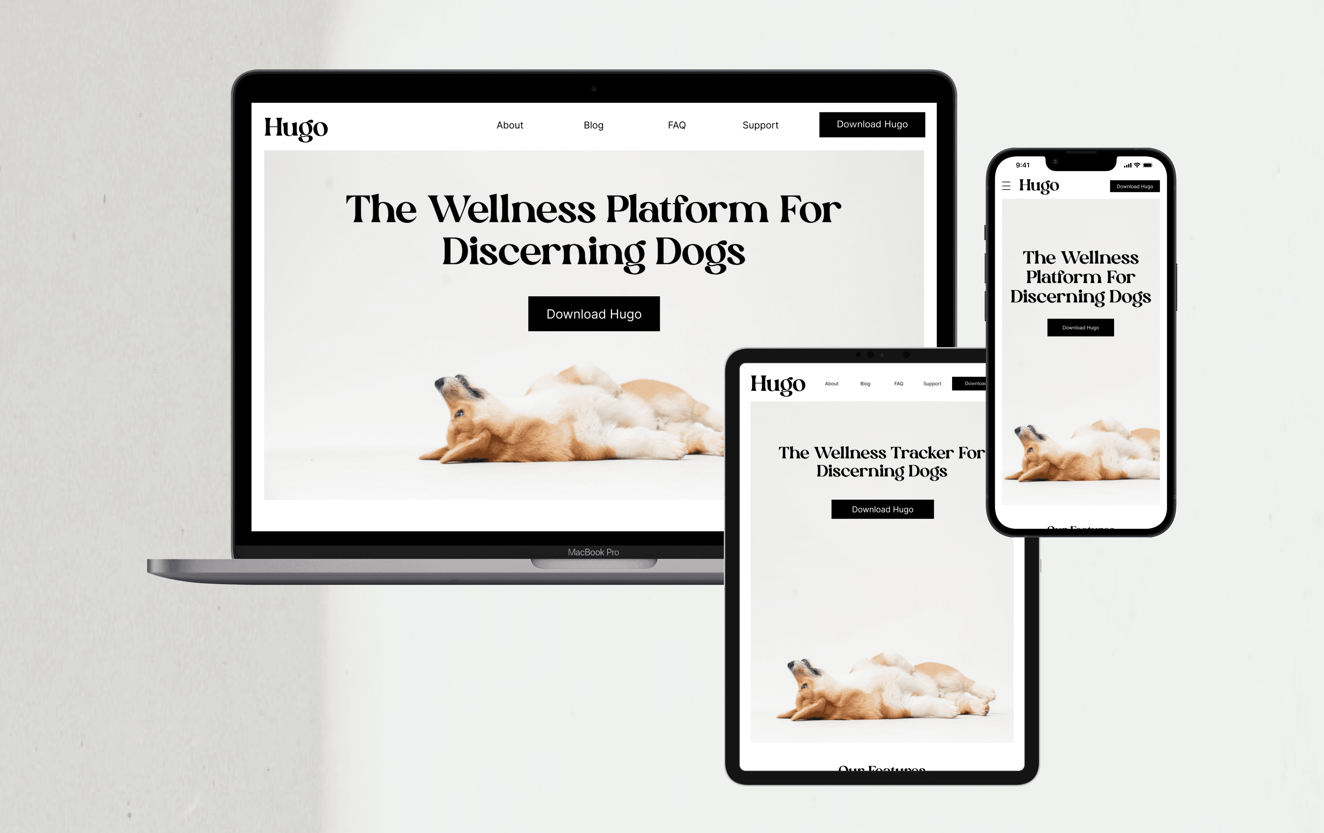
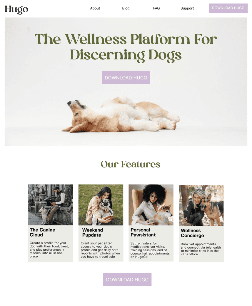
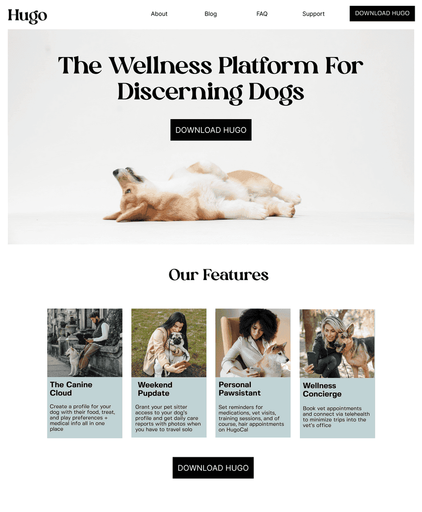
The Final Marketing Landing Pages
Once I had my style guide in place I was able to take my midfi prototypes to hifi and sought peer feedback to make sure navigation felt intuitive and that all information on the page was relevant.
