Case Study: Helen Phelan Studio

A redesigned brand style guide and marketing landing page that reflects Helen Phelan Studio's mission of accessible, creative, and athletic wellness


UX Design, UI Design | 3 week timeline
(View live on helenphelanstudio.com)

UX Design, UI Design | 3 week timeline
(View live on helenphelanstudio.com)

The Ask

Understand how users and potential new clients interact with digital fitness content, simplify and streamline information architecture, and create an updated visual identity for Helen Phelan Studio that excites subscribers and attracts new clients.

The Users

Exercisers who are:

  • women between the ages of 25-40

  • who live in NYC

  • who have tried at least one other on demand fitness platform

The Challenge

Redesign the marketing landing page so it feels updated, refreshed, and motivational without being so jarringly different that the brand is unrecognizable.

The Solution

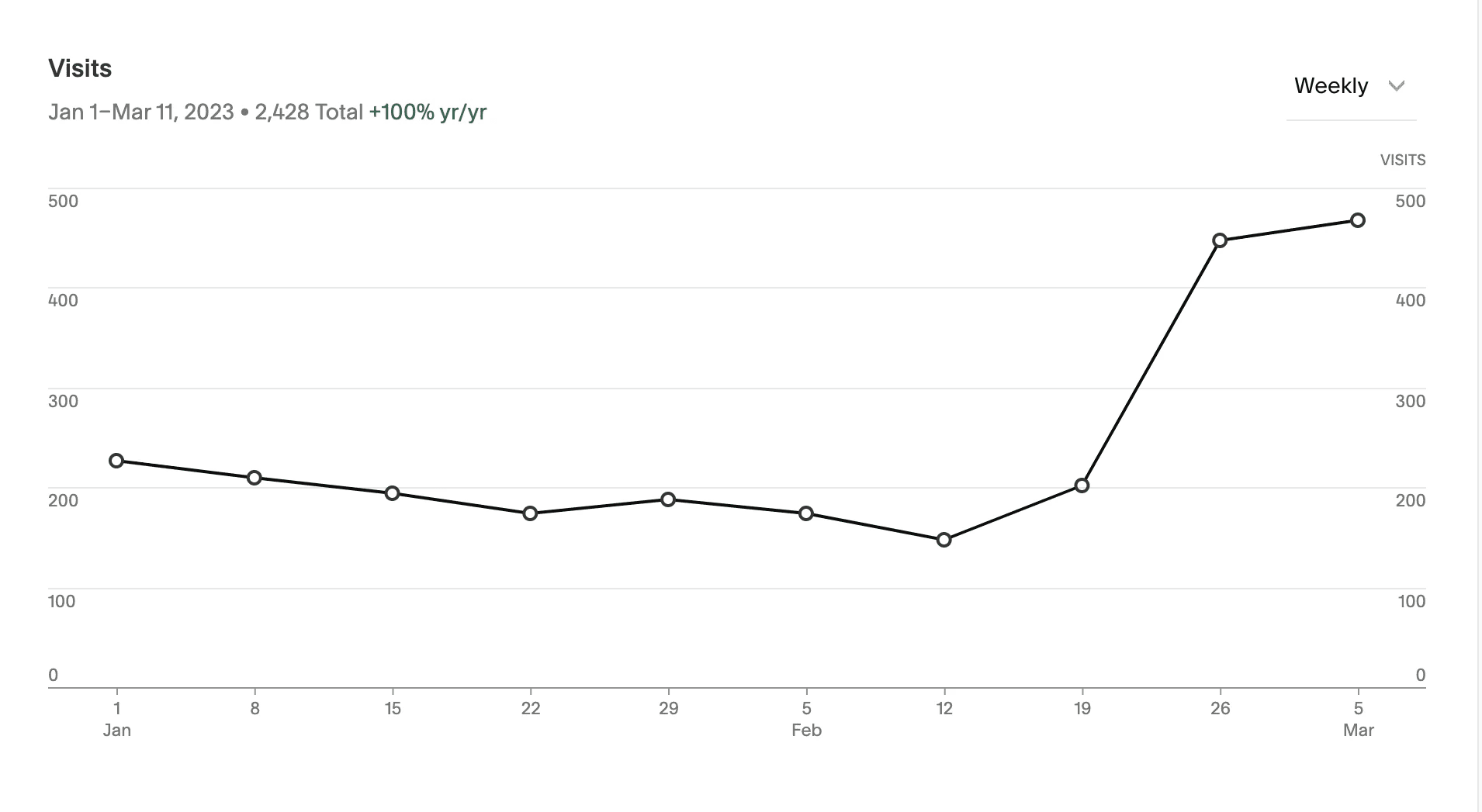
An updated marketing landing page and video hosting platform that helps potential users find membership, class, and retreat information quickly and easily resulting in a 50% increase in revenue and increased site traffic by 75% the month of launch, and greatly reduced the amount of customer support emails received.

*Helen Phelan Studio was awarded a 2021 Women’s Health Magazine Fit Tech Award

Design Process & Agile Timeline

Sprint 1

Competitive Analysis

Domain Research

Moodboarding

Final Site Map

Sprint 2

Logo Iteration

Style Tile

Sketching

Reworking Existing Photos

Sprint 3

Marketing Copy

Usability Testing

HiFi Marketing Landing Pages

Customize Video Platform


Competitive Analysis

I looked at the the branding choices of my competitors to get a starting point for inspiration and pinpoint any areas for differentiation for HPS.

Key Takeaway: Most competitors used minimal color palettes to create a calming emphasis on mindful movement.

User Interviews

Participants:

I reached out to 5 active subscribers of HPS for structured 1:1 interviews on Zoom.

Participants:

I reached out to 5 active subscribers of HPS for structured 1:1 interviews on Zoom.

Participants:

I reached out to 5 active subscribers of HPS for structured 1:1 interviews on Zoom.

Women between the ages of 25-40

Women who live in NYC

Women who have tried at least one other on demand fitness platform

Key Participant Pain Points:

“Wellness is chronically over-curated and unrealistic. I like pretty branding but it's important to remember everyone’s human.”

“My digital attention span after Covid is fried and I can’t focus on reading a ton of titles in a huge class library or busy visuals.”

“Diet culture makes it hard to stay consistent with exercise without shame.”

“Diet culture makes it hard to stay consistent with exercise without shame.”

Developing A Style Guide

Moodboarding: Multiple interviewees communicated anxiety and shame, so I knew I needed to create a calm, positive experience on HPS to help set the scene for them to reframe their relationship with fitness.


I came up with the following 3 adjectives to shape my mood board and guide the evolution of the visuals:

Athletic

Intuitive

Clear

Color: Knowing that my users were battling both body image stressors and digital fatigue I made the following color choices:


White: to create a sense of tranquility and calm

Black: to communicate the physical strength gained during HPS workouts

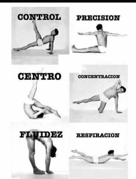
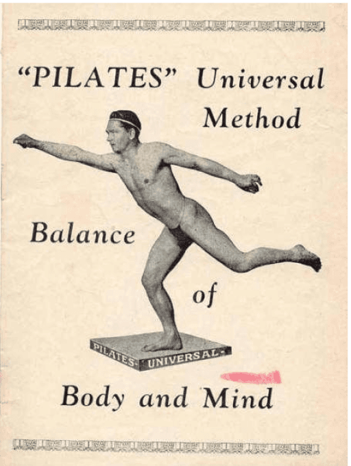
Taupe: to echo the vintage tones of archive Joseph Pilates' documents and photography and replicate the IRL studio experience


Original Color Palette

Updated Color Palette

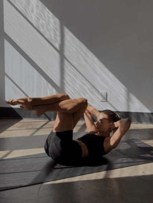
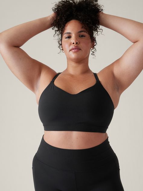
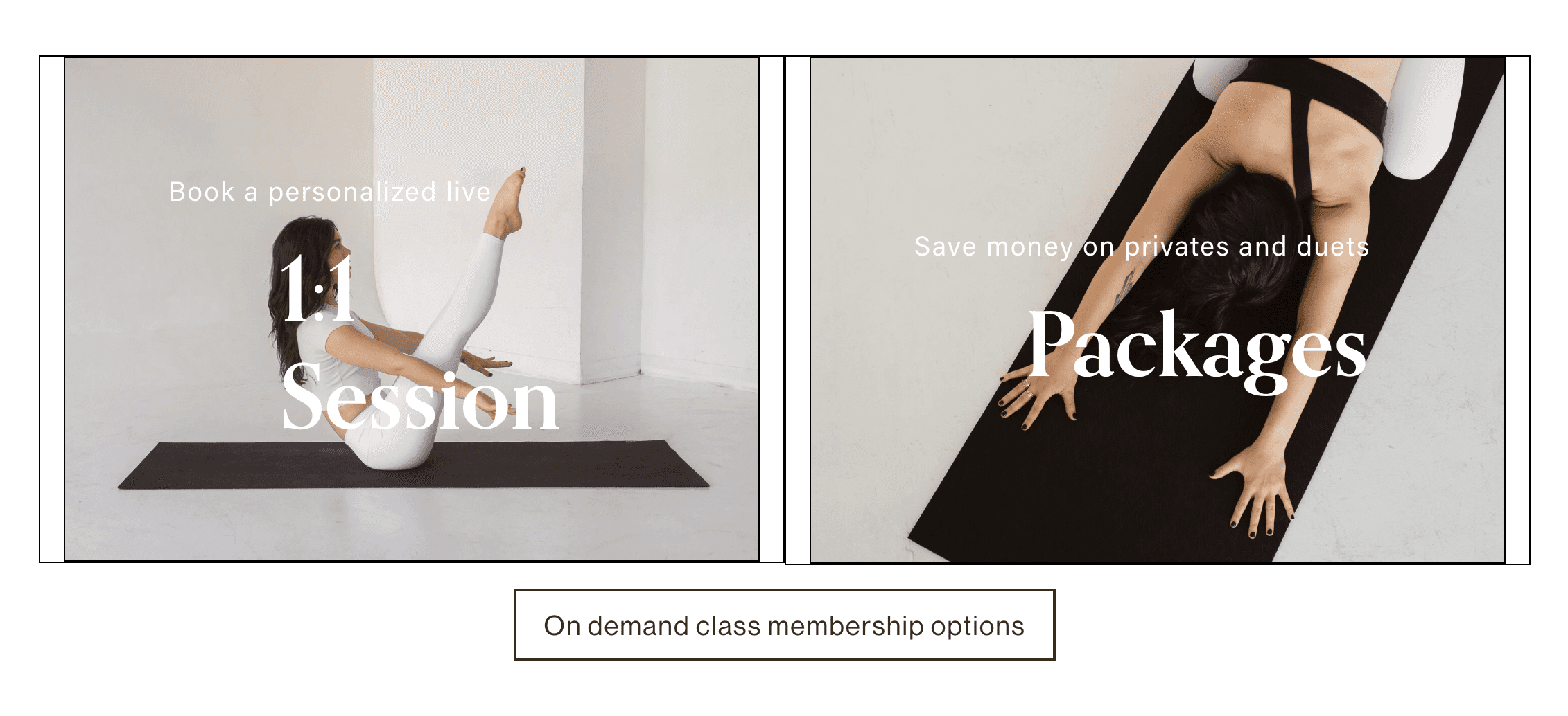
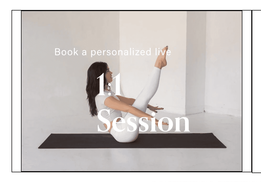
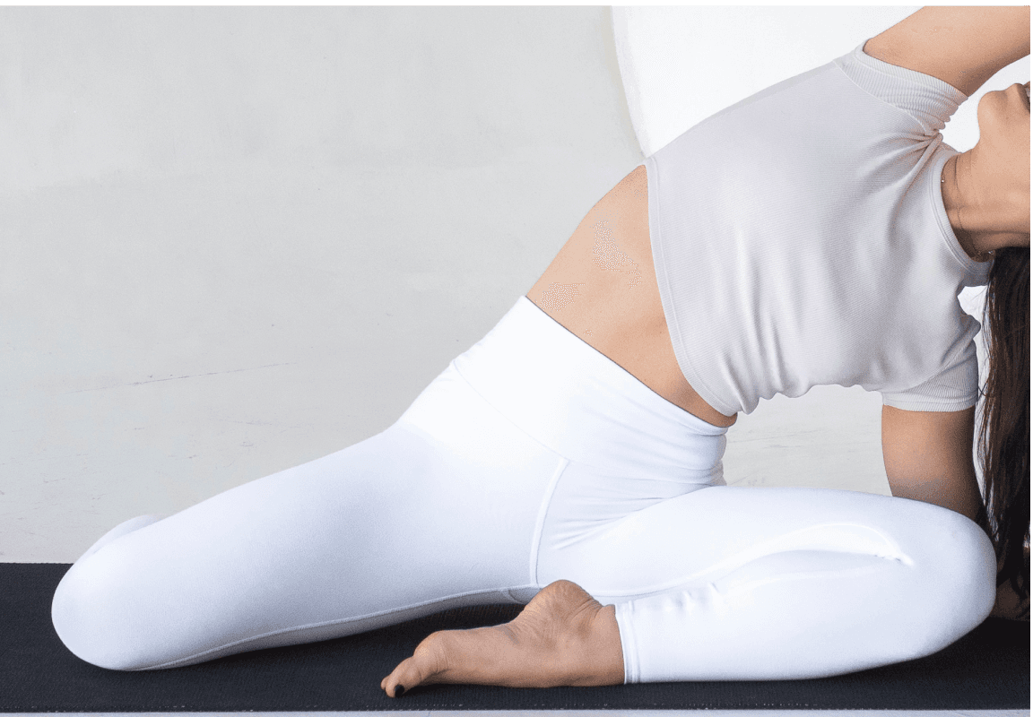
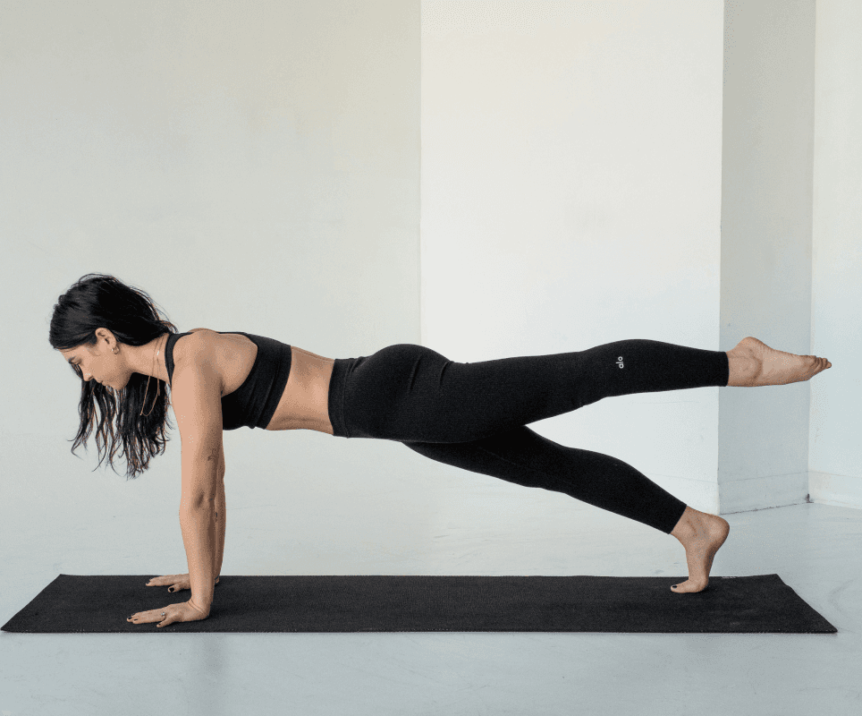
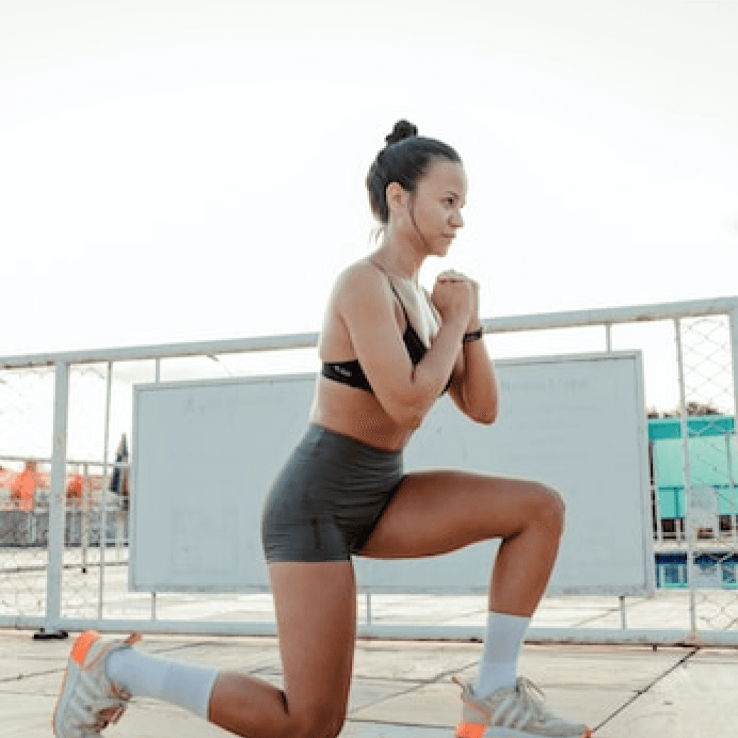
Imagery: On a small budget, I couldn't afford a new marketing shoot, so, I removed the frosted filter on existing assets to align with the cleaner, bolder identity, and incorporated black and white images for emphasis.


All images are brightly lit with clean backdrops, clothing matches the color palette, use a mix of black and white and color to show emphasis, and display only the mat and the body to reduce visual clutter, promote intention, and create unity across the brand.


Logo: Interview participants communicated that in their distaste for diet culture they felt stuck between choosing body kindness or athletic rigor.


To convey that you can do both, I opted to steer away from the softer serif choice in the previous iteration in favor of a bolder sans serif to exemplify physical strength and drive home the HPS philosophy that less is more.


I made the decision to de-emphasize my name in the logo to subtly remind users that teachers are not gurus and that their practice will ultimately be an individual experience.

Site Organization & Sketching

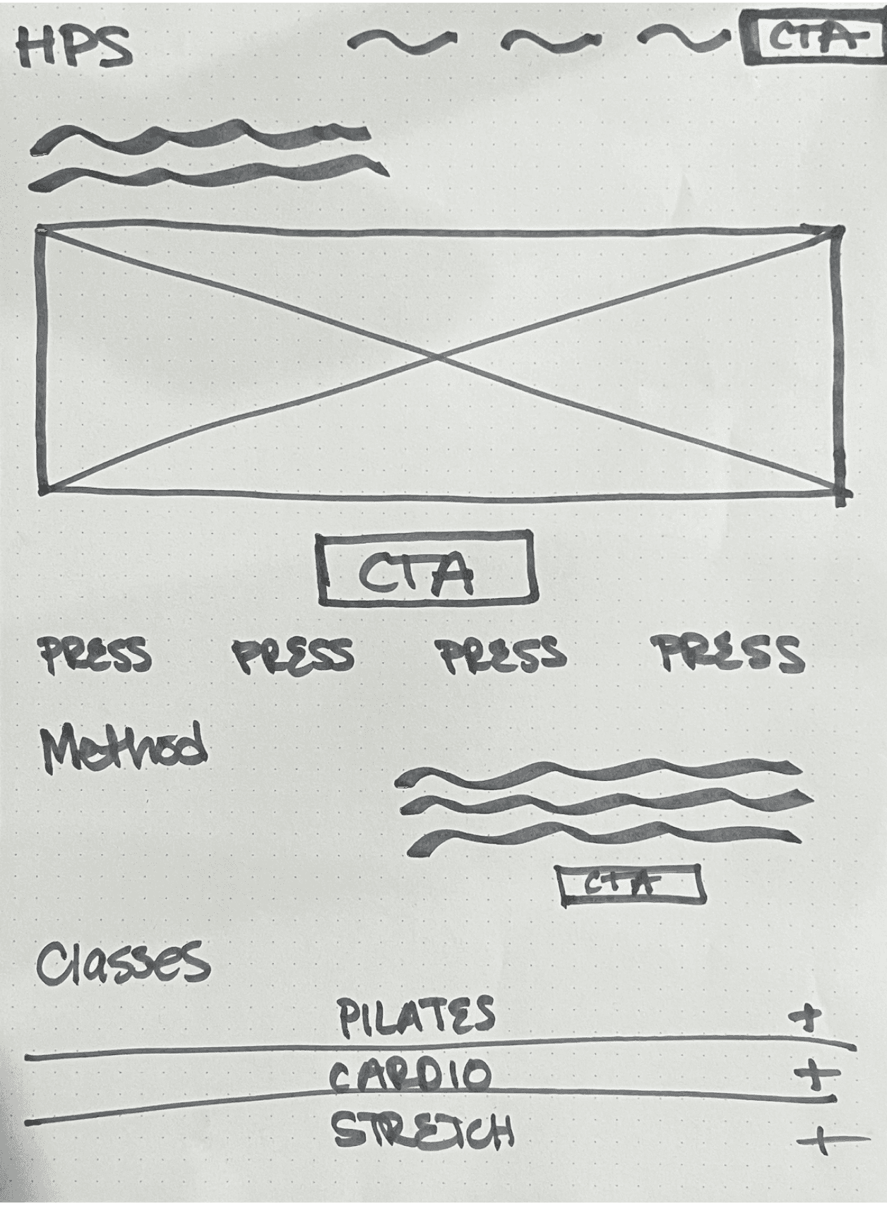
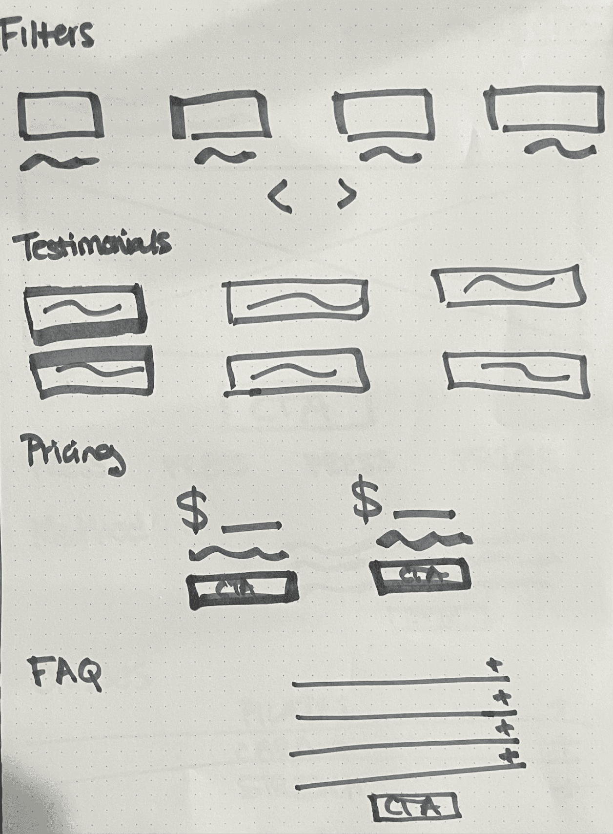
Before sketching, I organized the information architecture by compiling a list of the content needed to encourage conversion and minimize the amount of customer support questions in my inbox:


  • Free Trial CTA

  • Press Features

  • About Helen

  • Testimonials

  • Retreats

  • Corporate Wellness

  • FAQs

  • Pricing

  • Newsletter Sign Up

  • Additional Links & Resources

Usability Testing

Because HPS is hosted on Squarespace, I went directly to HiFi for usability testing to validate if the updated color palette and logo were successful in communicating athleticism and simplicity and answer the following questions:

Are visitors able to find the 10 day free trial?

Are visitors able to find membership info and pricing?

Do visitors have an easy time navigating the page?

Participants:

I met with 5 new website visitors 1:1 on Zoom and asked them to think through their process out loud as they completed the following task scenario:

Participants:

I met with 5 new website visitors 1:1 on Zoom and asked them to think through their process out loud as they completed the following task scenario:

Participants:

I met with 5 new website visitors 1:1 on Zoom and asked them to think through their process out loud as they completed the following task scenario:

Women who have not taken an in person class with me before

Women who follow me on Instagram and Tiktok

Women who are not already HPS subscribers

“You are a working mom on a business trip who needs to find a virtual workout membership. Use the HPS site to research the studio and sign up for a 10 day free trial.”

Key Insights From Testing:

Clients who find HPS through social media already feel familiar with me but still need more info about the classes

New visitors were confused what “Schedule” meant and didn’t realize they could book private sessions there

New visitors didn’t know there were other modalities in addition to pilates

How I iterated based on user feedback:


  • I substituted an “About The Method” where I had "About Helen" to give users a better idea of the teaching approach and linked to a separate "About Helen" page for those that still wanted to read more


  • I changed the wording on the top nav from “Schedule” to “Private Sessions & Group Classes” with a drop down menu to make navigation clearer.


  • I added a class category/description section on the marketing landing page so new visitors could see all offerings before joining the membership.


  • I added workout length and props required to class titles to save users time and offer more class context.

The Results

The final marketing landing page showcases the upgraded branding and clearer site organization resulting in:

  • 75% increase in site traffic after launch

  • 84% trial conversion rate in new members joining subscription

  • 50% increase in revenue the month of launch

  • 45 new still active members

  • 69.3% email open rate from former HPS subscribers

  • 83.7% email open rate from existing HPS subscribers

  • 51.8% email open rate from users who never subscribed to HPS but engage with my newsletter

With a clear outline and low fi paper prototype, I took the design to Hifi. I had an existing website hosted on Squarespace, so instead of building the website out in Figma in Hifi, I searched for a Squarespace template that looked the most similar to my sketches and customized it according to my new style guide layout preferences.


After launching the redesign to existing, former and potential subscribers, HPS experience a 50% increase in MRR.

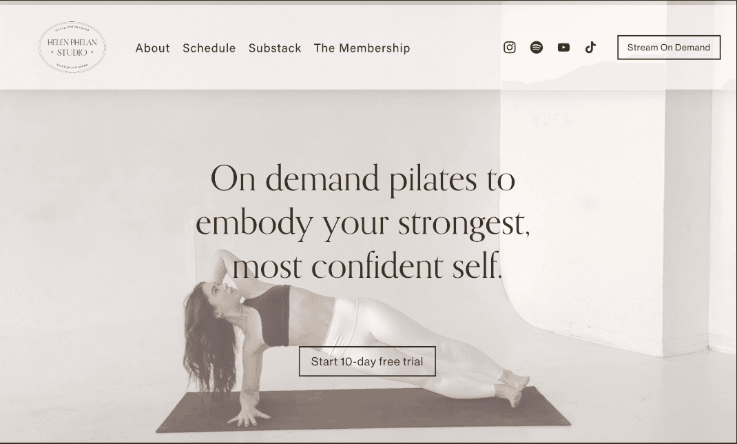
Old Home Page

Updated Home Page (View live on helenphelanstudio.com)