Case Study: Haydn AI
Design Process & Agile Sprint Timeline
IA Competitive Analysis
Usabilty Test Plan
Card Sorting
Final Site Map
MidFi & HiFi Prototypes of Mobile, Tablet, & Desktop Marketing Landing Pages
Bring midFi mobile screens to hiFi
Present to stakeholders
Competitive Analysis
I conducted a competitive analysis of the visual design and information architecture of 3 of our competitors to make sure HaydnAI’s marketing landing page structure was in line with our competitors and trends in the AI space. This helped me and create my initial site map based on the design models I found amongst competitors.

Key Takeaways:
Frequent repetition of CTAs to highlight the Free Trial
Most important navigation items like Pricing, Support, and Features all listed clearly in top navigation
Supplementary navigation items that don’t immediately relate to the CTA should be listed in Footer
User Research
Objective: Confirm that the HaydnAI site map matched the mental mapping of our users to make it as easily usable as possible before finalizing my information architecture and moving forward to sketching and prototyping.
Audience: I tested with two target users who met our demographic screener requirements of being over the age of 18, who actively use email, social media, and blogs.
Method: I conducted a one on one, in person, closed card sort using OptimalWorkshop with each user I tasked users with sorting the cards into similar categories and asked them to reflect by thinking out loud as they organized their cards to gain insight on their thought process.
I used the OptimalWorkshop analytics to help analyze insights about which cards appeared together most often and how often cards appeared in specific categories.
Explanation of results:
The navigation I created for Pricing was completely validated by closed card sorting with 100% of participants successfully categorizing Free Personal Plan, Free Trial, and Paid Business Plan.
Both users struggled with deciding where FAQ should go because it could help the user learn about the product under About or trouble shoot under support.
50% of users chose one over the other, but mentioned out loud that it makes sense to have it in both places.
The same sentiment was communicated regarding Chat and Email being important to access under both Support and Contact even though 100% users, when faced with only one option to categorize them, marked Chat and Email as Contact.
Actions taken after research to finalize Site Map:

Original Site Map

Updated Site Map
Additional navigation pathway under Pricing to Free Trial, Paid/Business Plan, as well as via Login/Sign up and included multiple pathways for the user to find Email Us and Chat under both Support and Contact as Chat.
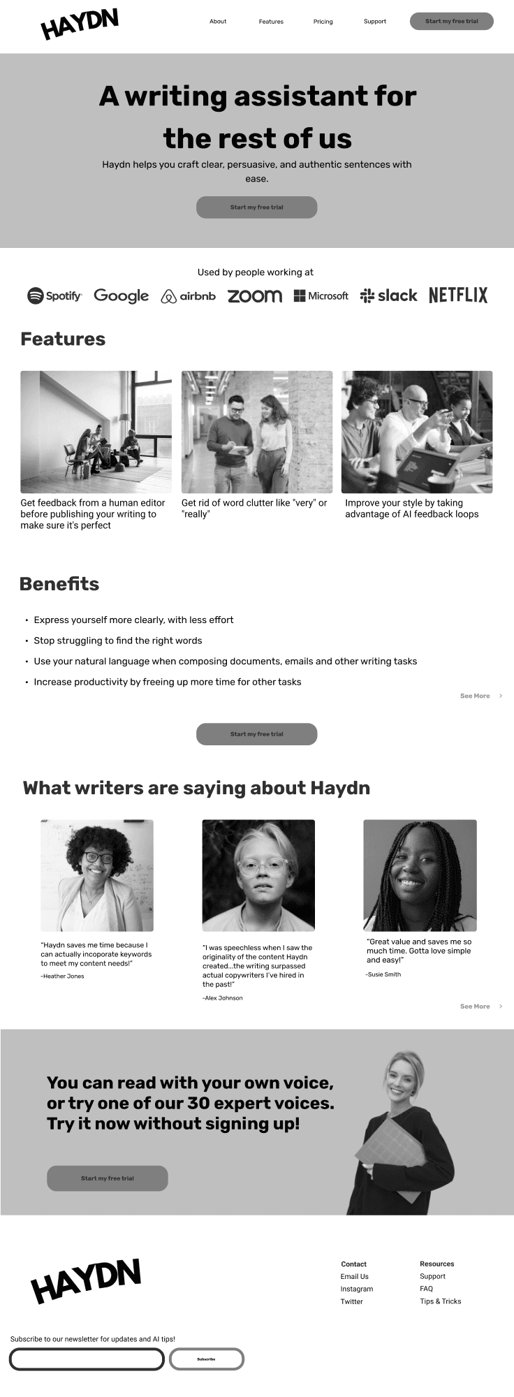
MidFi Marketing Landing Pages
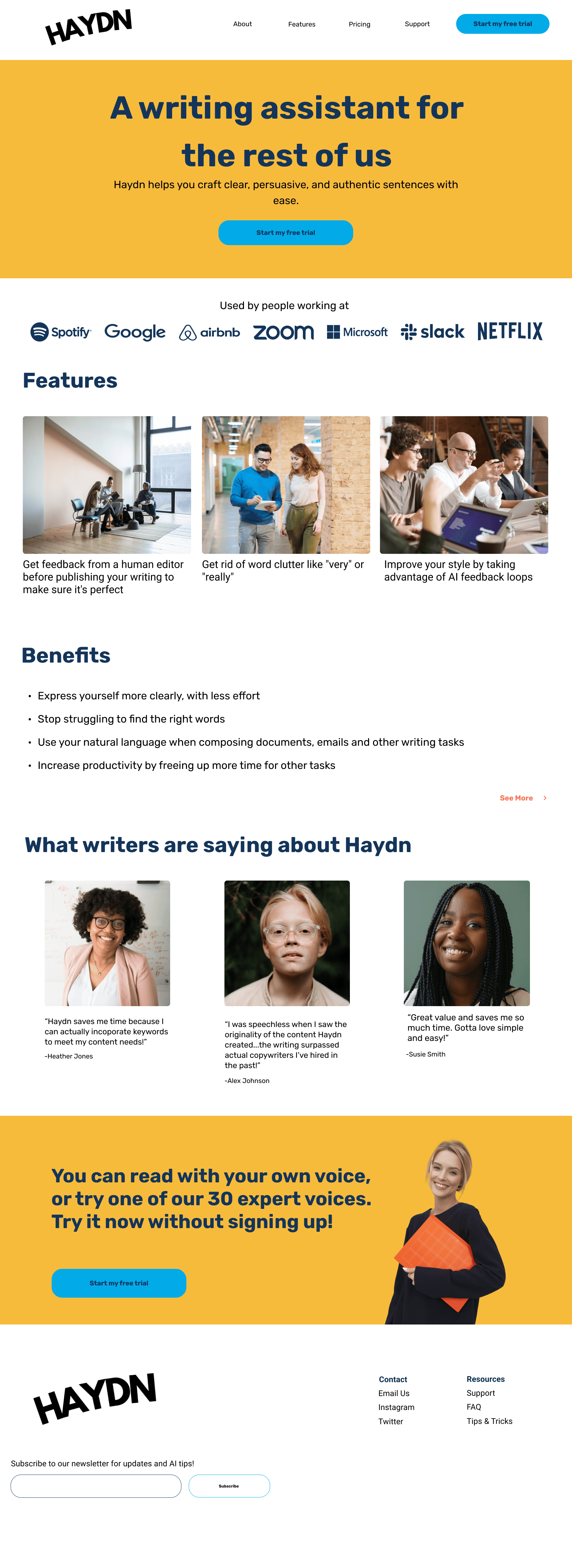
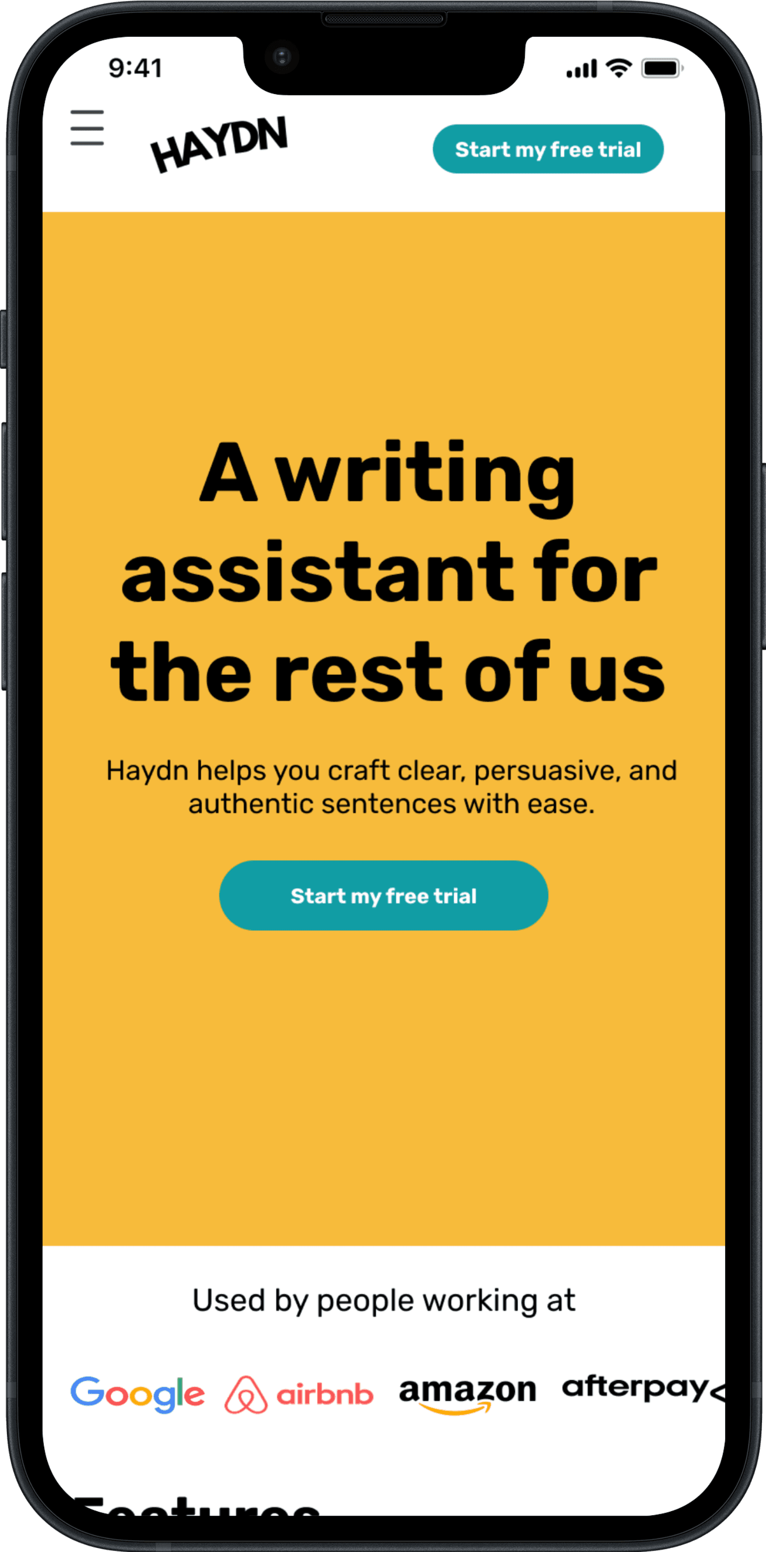
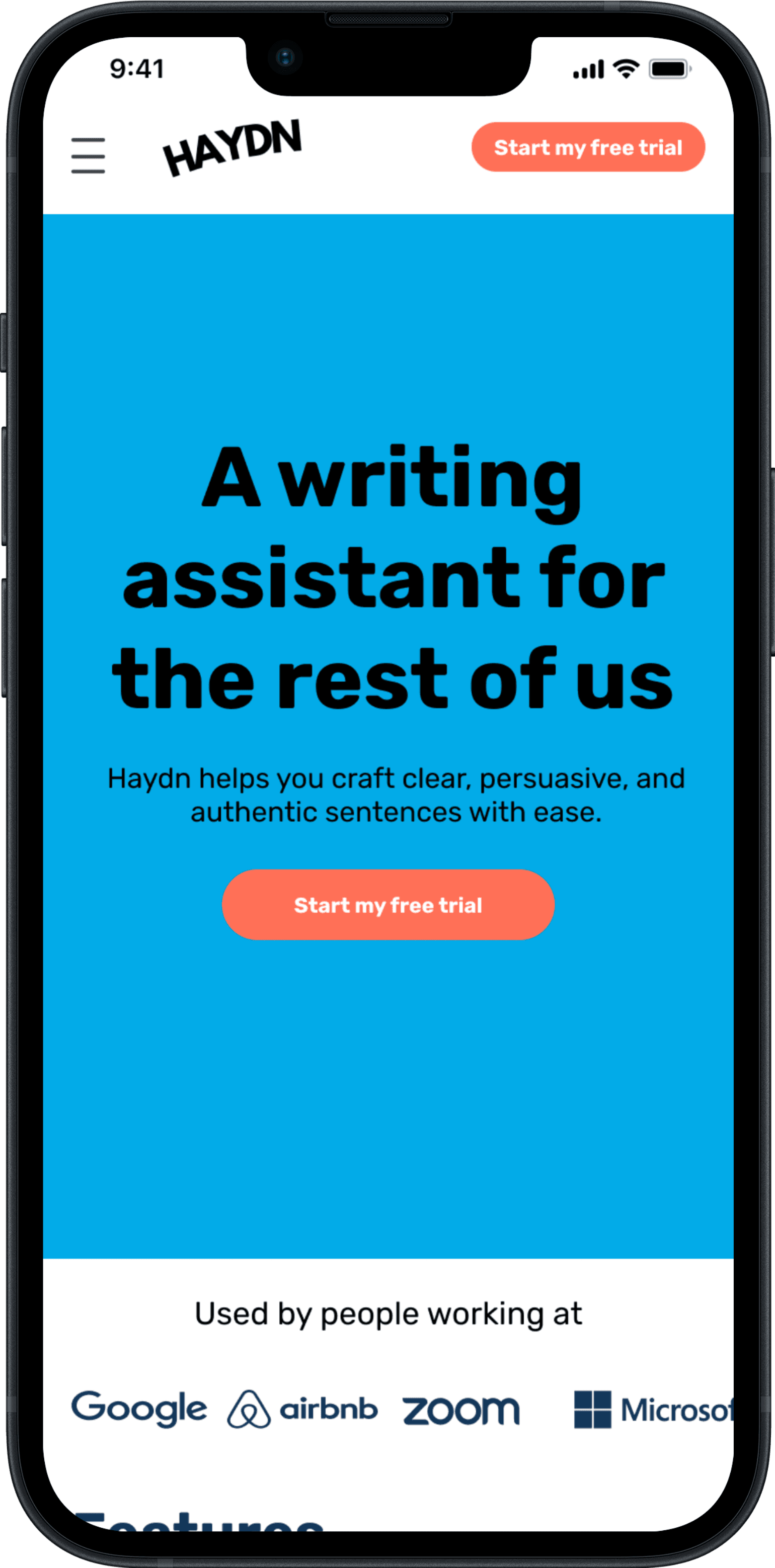
I upgraded the MidFi desktop landing page to HiFi by designing the mobile version first while incorporating research insights to ensure there were clear CTAs visible on the page at all times.

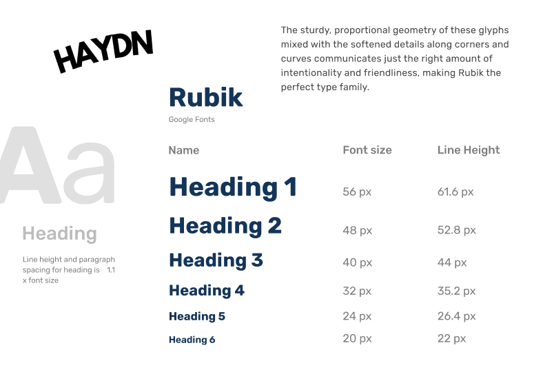
Designing Within An Inherited Style Guide
I was given a brand style guide in my brief inclusive of:
logo
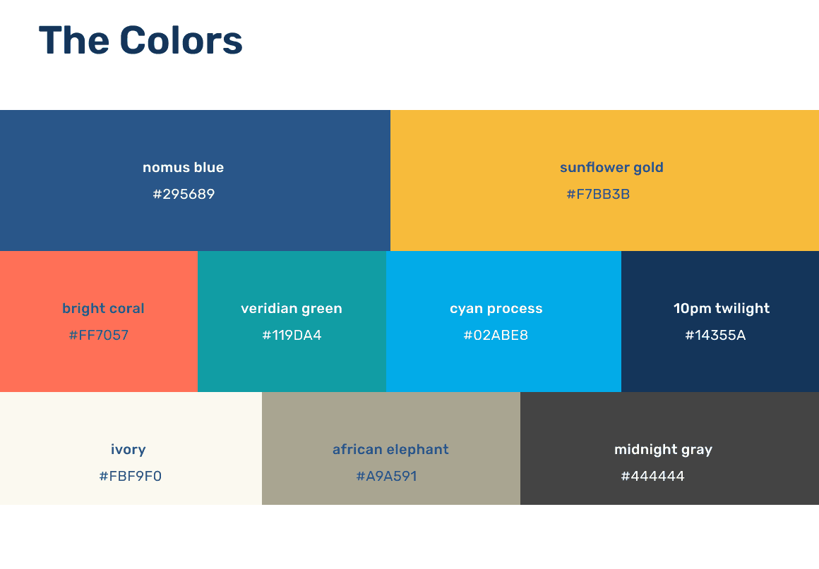
color palette
voice and tone styling
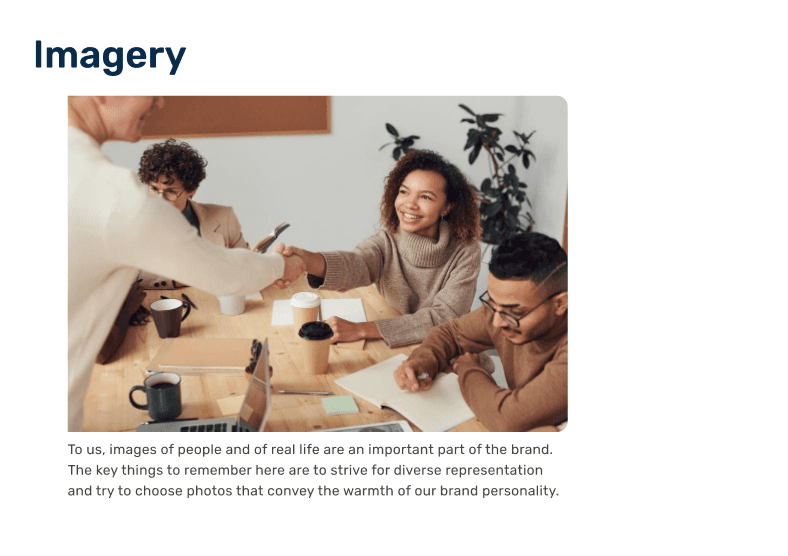
imagery guidelines
marketing copy
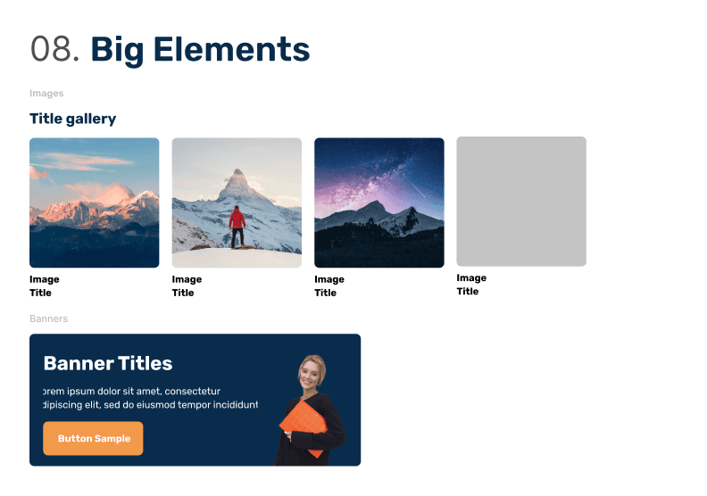
a system for large elements
The style guide called for a “beach formal” tone of relaxed but polished friendliness and a respectable but approachable energy to help make using an AI generator feel less intimidating.
Usability Testing Potential Color Application
After confirming AA accessibility, I reached out to the same users from card sorting to identify which color application was more successful in drawing attention to the CTAs.
We met in person, one on one, and I asked them to navigate through each animated prototype in Figma and think out loud as they navigated the marketing landing pages to start their free trial.
What I learned from testing:
Green and coral as CTA colors felt hard on the eyes despite passing accessibility checks
The yellow did a good job of conveying a sunny, friendly energy
Brand colors in partner logos were busy and distracting
10
30
Express yourself more clearly, with less effort
Stop struggling to find the right words
Use your natural language when composing documents, emails and other writing tasks
Increase productivity by freeing up more time for other tasks
See More
Used by people working at
You can read with your own voice, or try one of our 30 expert voices. Try it now without signing up!
Start my free trial
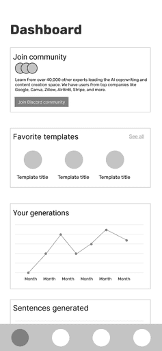
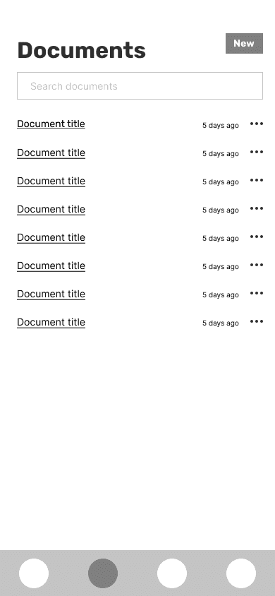
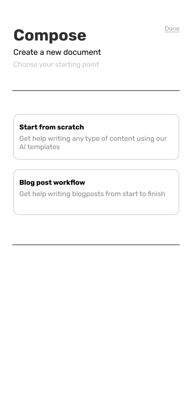
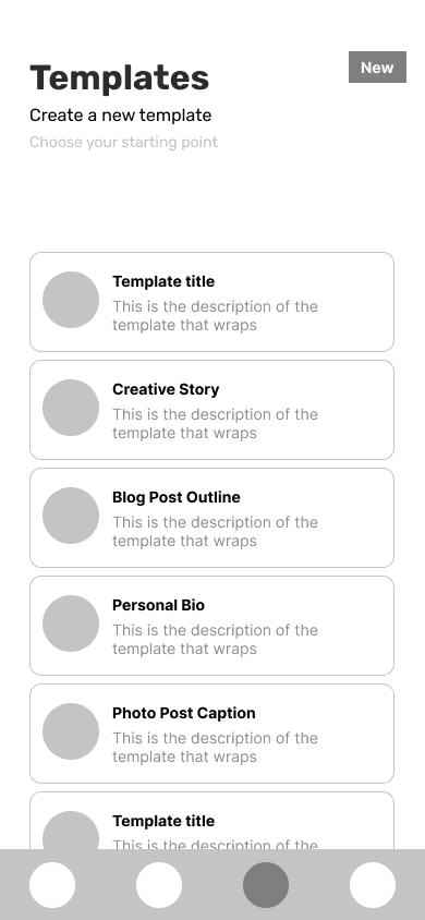
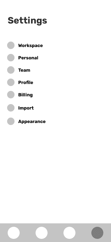
Bringing Inherited MidFi App Screens To HiFi
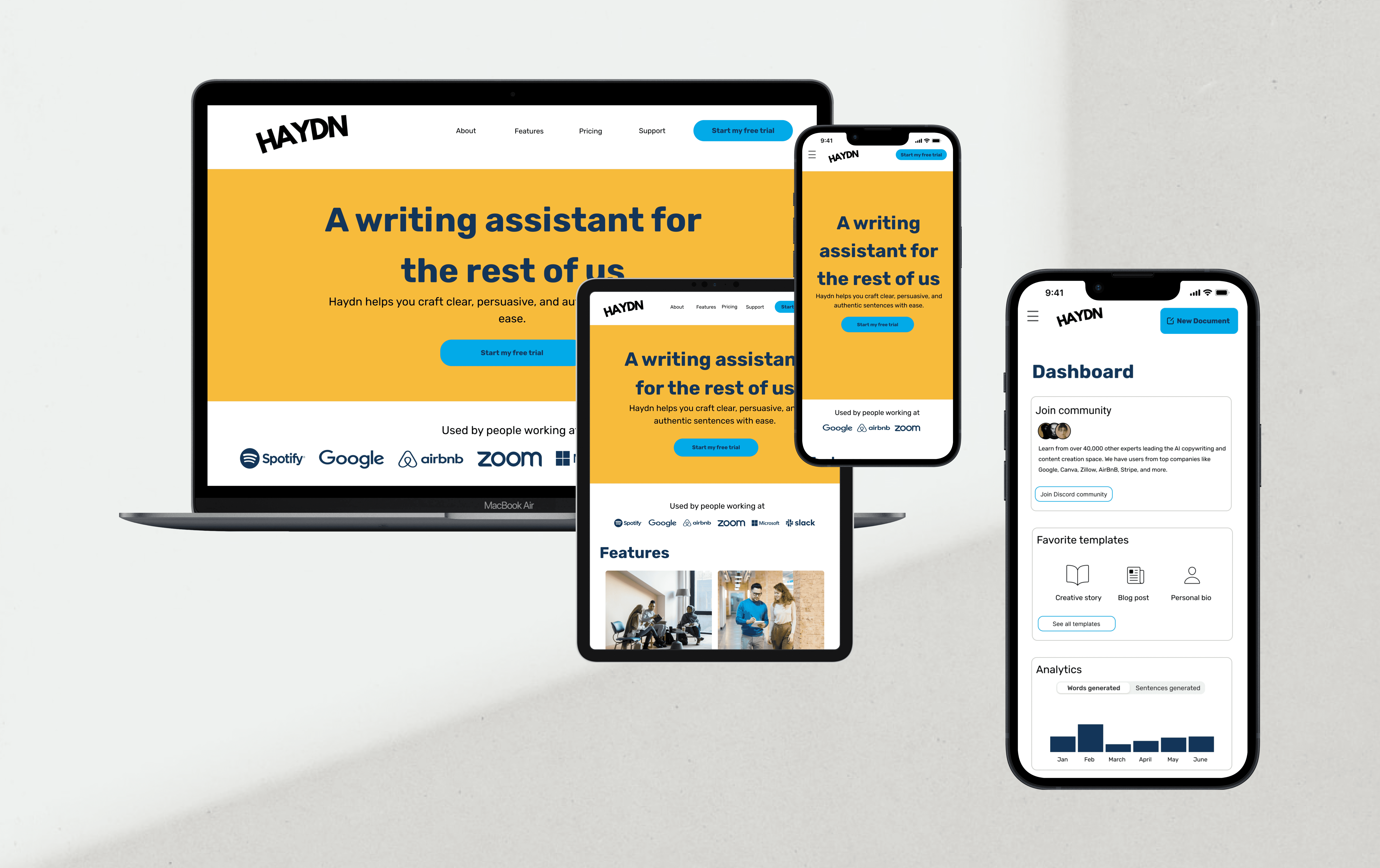
After finalizing the color application and visual hierarchy on my marketing landing pages, I was able to bring the MidFi mobile app screen wireframes I inherited into HiFi with the same application of color.
Color was used even more sparingly to prioritize accessibility and ease of function but the usage of turquoise as the primary CTA remained consistent to reduce cognitive load on users.
The Final Marketing Landing Pages


